Below is access to a document version of the film presented as contribution in part i of the scroll serial. Note that the formatting in this version carries a black bordering around the image that was not present in the screened version. An uninterrupted dark (lights off/phone off) setting is suggested. The runtime is 24 minutes 11 seconds. Viewing the film before looking at the additional documentation and written analysis is strongly encouraged.
Document version of the film (pswd: scroll_part_i)
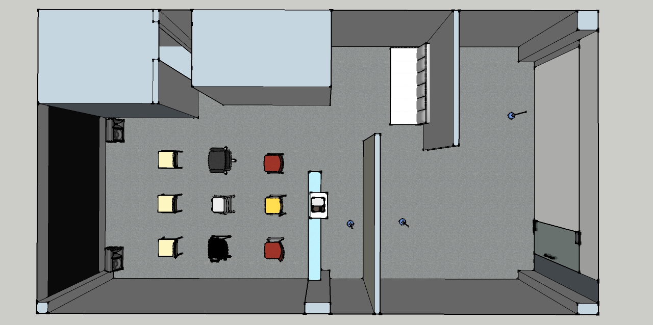
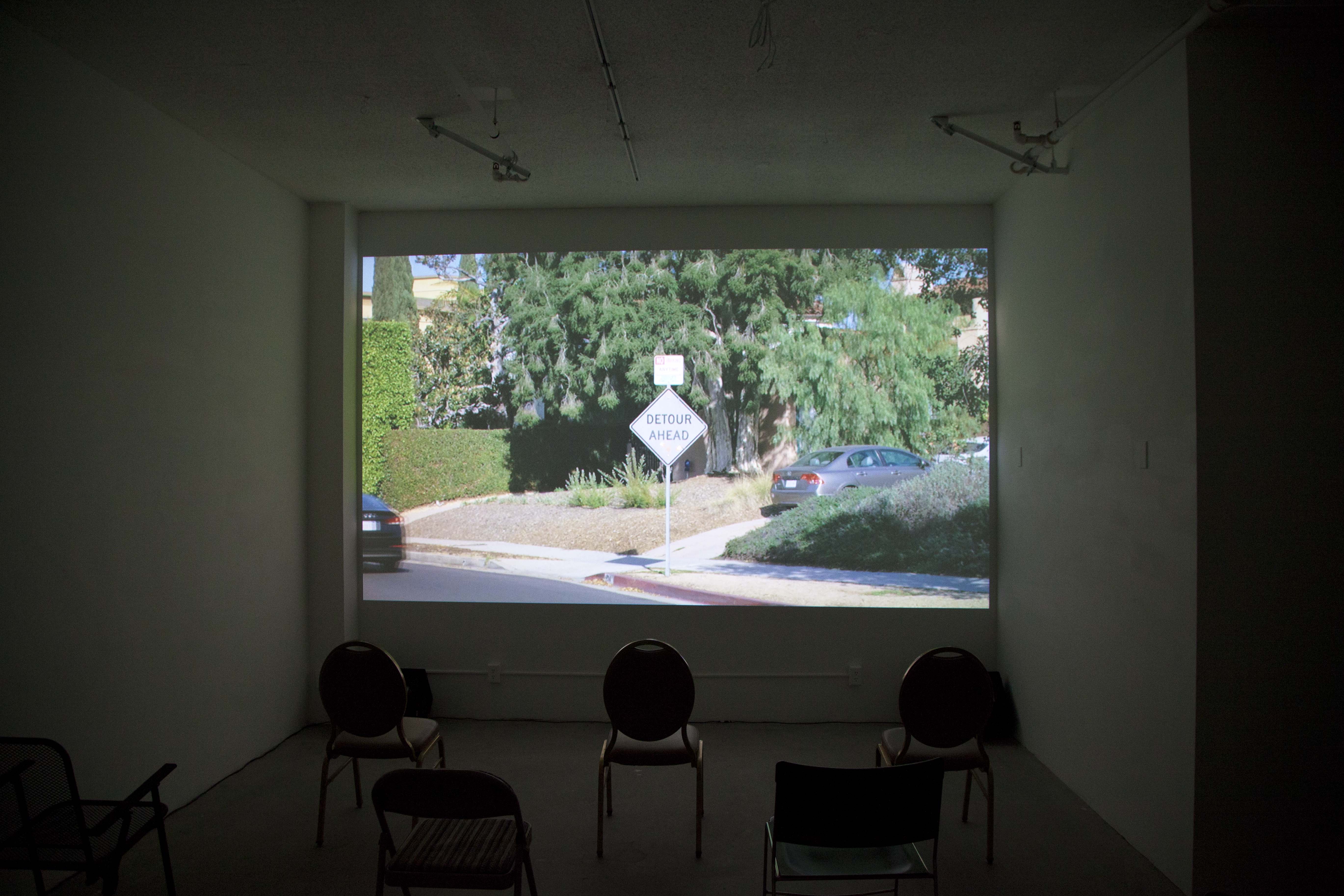
The film - a term used as a reference to the cinematic rather than an indicator of materiality - was produced for the scroll screening series, curated by Matt Town, who was in a one-year (2017-2018), post-graduate residency program through the California Institute of the Arts located at The Reef: A Creative Habitat, located immediately south of Downtown Los Angeles. The series took place in the smaller of two spaces allotted to the four artists-in-residence that had come to function solely as a venue for this series on Tuesday evenings in an eighteen week cycle. A partition wall was built as part of the screening architecture to privatize an otherwise exposed view through the glass entry off a common corridor shared by start-ups, creative ateliers and the like within the multi-storied complex. The premise for this series developed from a curatorial inquiry into the ways in which painting and film (the static and non-static) are relational and fungible when simultaneously present. This was architecturally coerced through drawing attention between two facing wall planes: the constructed partition specifically built for this series set in parallel to the preexisting back wall of the room. An expanse of twenty-three feet designates an interior space for viewing and socializing between. Each wall plane was designated and zoned as medium-specific: the partition as the site for painting, the back wall as the site for film. Blue spot lights were installed in the room which serving as the only light source until a screening commenced at which time the "white" box, cast in blue, became a "black" one, cast in the refracted light of the projected image bouncing off the back wall.
Invitations were made to eighteen individuals who were paired as part of the curatorial act. To reinforce each participant engage equally with the painterly and cinematic planes, the invitation carried the condition that each participant would be accountable for contributing to two occasions and both respectively designated planar zones. In effect, a reversal of the initial planar positions taken by each pair were the criteria for each follow-up event: the individual initially providing a moving image would subsequently need to respond in consideration of painting and vice versa in the companion event occurring at equidistance from the prior arrangement within the eighteen-week duration. While I am generally suspicious of medium-centric curations, a multi-year dialogue with the curator that entailed discussing questions of a static/non-static dialectic relative to the languages of film and painting provided me with an enriched and decompressed perspective relative to this categorical, curatorial conceit. I learned that in certain cases this curatorial invitation entailed a request to include specific preexisting artworks from participants. In instances where a distinct request would be acceptable from only one of the paired contributors, the second individual had the potential of developing something responsive to the curatorial parameters relative to the assigned zone for the given event if not also extending this response to the pre-existing artwork of one's paired compliment.
During each evening event, visitors would arrive through the glass entrance of what appeared to be an otherwise empty room, lit by blue bulbs, until moving further into the space, walking around the partition, to then be greeted by the curator serving as bartender for the series. A half-hour on average was dedicated for socializing and engaging the painterly-responsive interior plane of the partition, before the lights dropped and the screening took precedence. At this point, everyone would turn away from the painting and bar, take a seat in an eclectic grid of chairs on the floor, and reorient towards the plane to hold the projected image. After the screening concluded, the projector was powered down, the curator would state any titles, authors and dates attributable to the given pairing on display. The blue lighting would be turned back on, signaling attention could turn again towards the painting, to further socializing among those present, and by extension and eventuality, the exit.
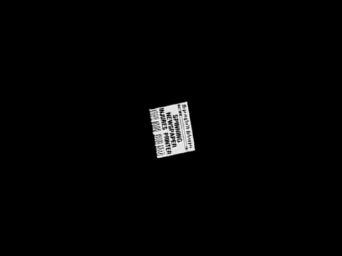
In my case, the pairing arose from a passing comment I had made while driving with Town upon seeing a temporary construction road sign on the way to an exhibit at the Los Angeles County Museum of Art. At a glance, the sign looked peculiarly gray by comparison to colors associated to such signage seen around an urban metropolis in perpetual upkeep, teardown, and gentrification on the move. It was in evident contrast to its vibrant surroundings. This visual interruption prompted me to remark while directing view out the windshield at this scene-in-passing, "film noir". Unbeknownst to me at the time, this aside in the midst of conversation on entirely different topics became the impetus for the pairing I was to be placed in which would entail, for the first event, being paired with a kinetic painting titled, "Killer on the Loose", by Keith Rocka Knittel.

This uniquely shaped, paint-on-board object approximated the scale of a newspaper in an "above the fold" orientation rendered as it might appear in a comic. Painted in a black-and-white palette in a cartoonish manner, the generalizing "Metro Post: Evening Edition", bares the headline in bold lettering "Killer on the Loose". The representational newspaper is backed by a wall-mount motor which induces a perpetual, clockwise spinning motion onto the overall image/object. The motor brings an auditory component of mechanical revolution to the work and by extension to any room it is installed within.

This augmented rotation to an otherwise assumedly inert picture plane references the trope and gag of the spinning newspaper interlude, first appearing in B-films of the 1930s and subsequently used to varying degrees, dramatic to satirical, as an economic means of world building in television and film in which a headline relevant to the narrative plot, by illusionistic effect, spins towards the picture plane (suggestive of a thrown paper hitting the streets or doorstep) before halting at near full screen view so as to be read by the theatre audience.

This is notably an expository device that keeps didactic information within the semblance of a world-building narrative. Ostensibly, a broader readership and public residing in the civic and/or national landscape in which the fictive narrative is set is reading these headlines just as we, the audience, are. This inferred broader public often remains inconsequential to the plot, not characters visually registering in the picture on-screen; instead, they comprise an implicitly large margin of an abstracted society sensationalized en masse by the hyperbole of the headlines. Initially, this cinematic effect was accomplished through a practical effect of a dolly drop or in-camera zoom on a sound stage coupled with a prop newspaper mounted to a "Lazy Susan" or equivalent thereof. More contemporary uses of the trope entail shooting the prop newspaper static with a spin and zoom applied in a digital post-production process.
The "Killer on the Loose" headline, functioning simultaneously as title of the artwork, and the generically, non-specific publication "Metro Post", invariably invokes the New York Post, founded by Rupert Murdoch, as a late-twentieth century, muck-racker rag deploying an amplified white-on-black graphic text layout. Further advanced in the handling of the paint, the paper's publisher situates this representational publication in the context of cartoons and comics, yet "Pg.6", included in the top right corner distinctively frames the reference as satirical: a commentary on the New York Post with a bizarro lens, doubling down on the already sensationalist and hyperbolic language of the headline, which reaches out from the black ground of an evening edition to be picked up for the commute home from a weary-inducing daily grind with rampant urder on the depleted mind. The attention-grabbing dynamism of such bombastic wording in the "Killer on the Loose" artwork and the ideological undertow of manipulating readership by collapsing "need to know" current events with unethical entertainment culture presented an incredibly sharp yet playful indictment of 2018 America’s socio-political state. Who is this Killer? Where? It could be anyone. They could be right around the corner waiting to strike again. Fear-mongering is divisive in such sensationalism, imbricating a society against itself through the abstract attributions of nationalism, fostering a false-means for suspicion among neighbors on a local level. I realized not long after being paired that my initial response to the series would need to account for both Town and Rocka Knittel's roles in the arrangement, choosing to recognize that by his curatorial involvement of selecting "Killer on the Loose", Town's hand was as present as the artist in contributing to the circumstances I was left to face on a cinematically front.
In consideration of the cinematic plane for this initial installment in scroll, I determined that returning to the scene of the crime in order to reassess what was commented on in passing was the place to begin. Having learned that it was this off-hand interruption I had made in a prior conversation that prompted this pairing with the "Killer on the Loose" rotary work, it seemed sensible to cite this prompt as a preliminary consideration in developing a response to all relative contextual conditions: "Killer on the Loose", the curatorial structure, and the architectural interior all called for sufficient observance. At the time of the remark in passing, I thought nothing more of this film noir assignation. When it was acknowledged that it was this moment which provided the impetus for the pairing, I was initially hesitant to accept, not because of the artist I was paired with nor the "Killer on the Loose" artwork - that had only been described to me, but I had not yet seen - but because my room to move conceptually felt severely limited, as though being held accountable to a casual and perhaps less than considerate comment already long forgotten by the speaker. After much back and forth on the matter, I finally heard a more articulate rationale from Town that I had actually invoked film noir in multiple conversations over years of dialogue together; instances, I had similarly forgotten. I accepted the premise of the pairing on the grounds that it would provide a learning opportunity to study this erasure, which apparently carried some significance as an analogical resource in the ongoing conversation. Thereafter, having seen documentation of "Killer on the Loose" installed elsewhere, I began to take steps in various directions, a handful of approaches under consideration. I eventually determined the most sensible approach was to remain in the space of citation and fix attention onto the thing which the conversation had turned to in passing, in lookie-loo fashion, picking up footing on a trail I apparently was already on for some time.
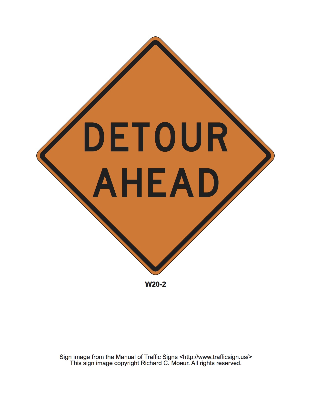
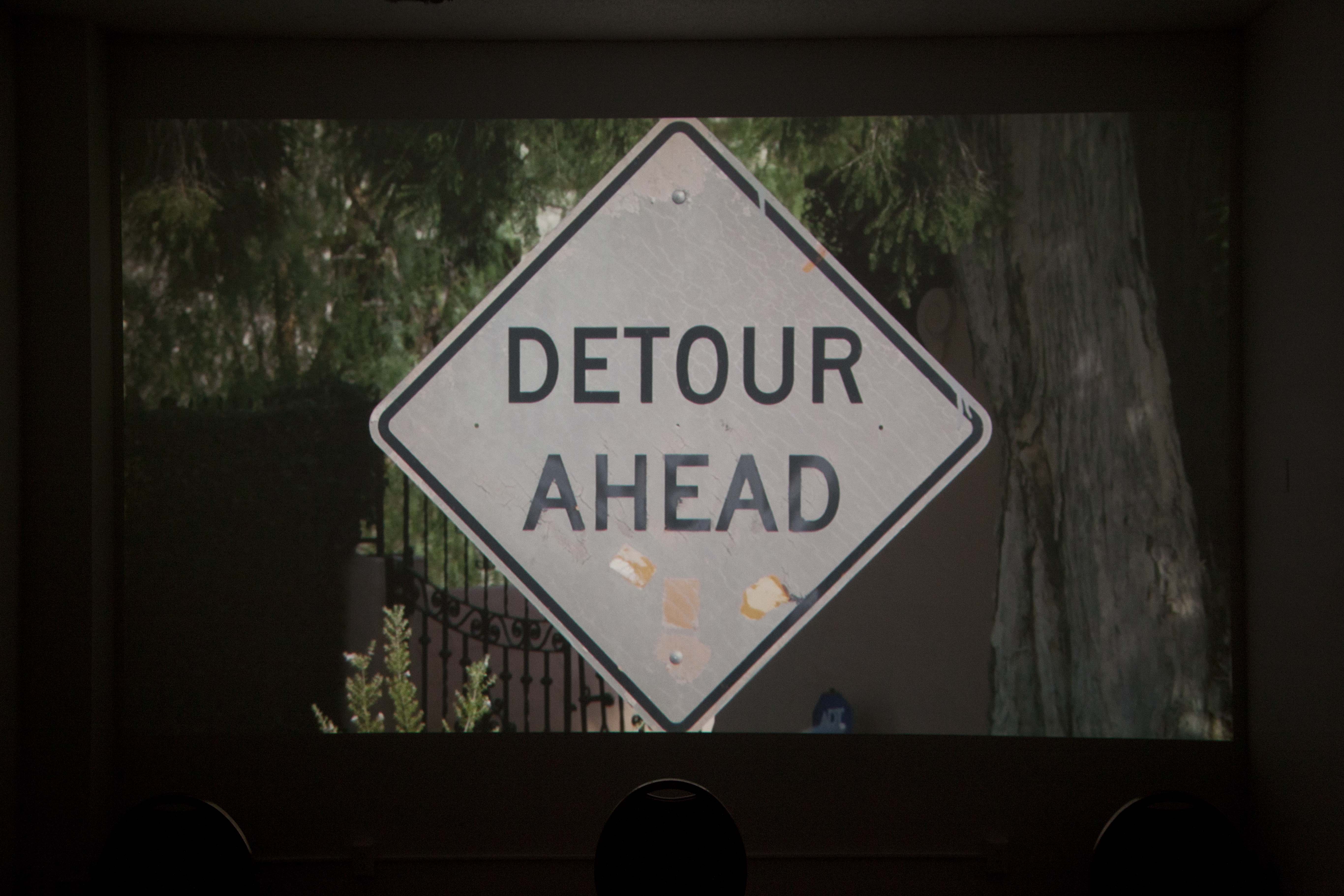
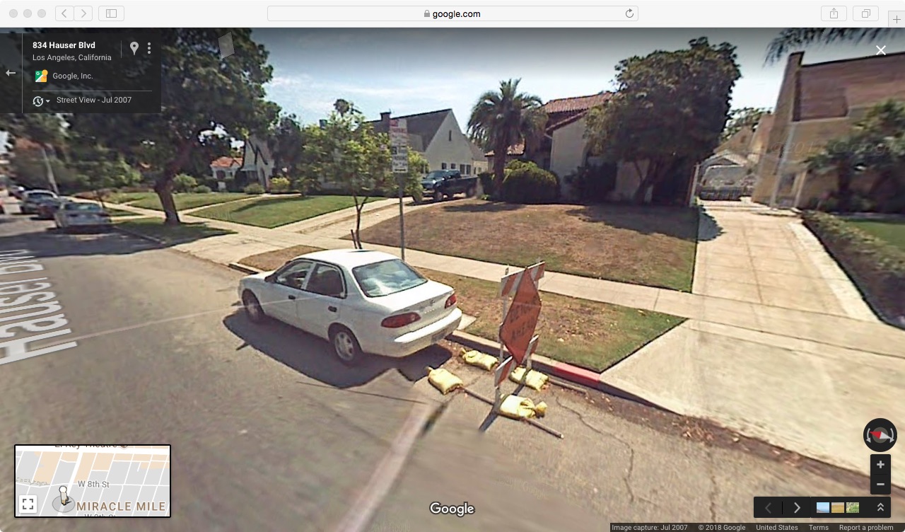
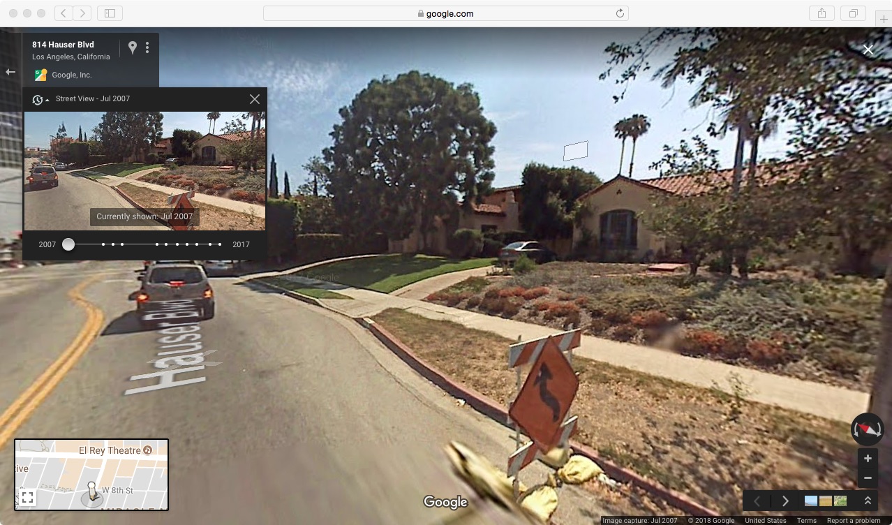
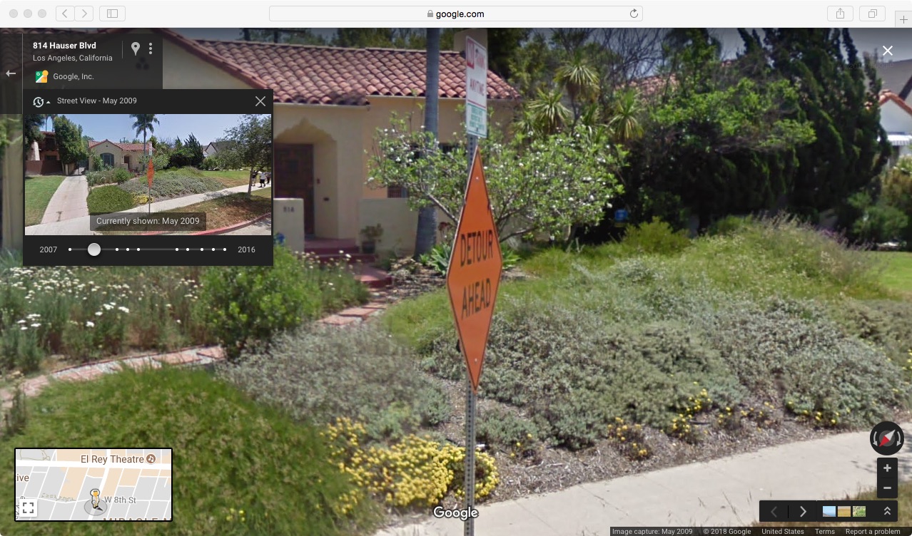
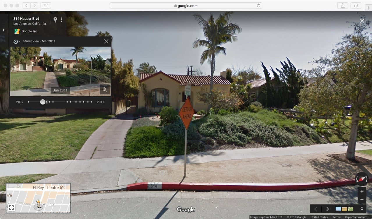
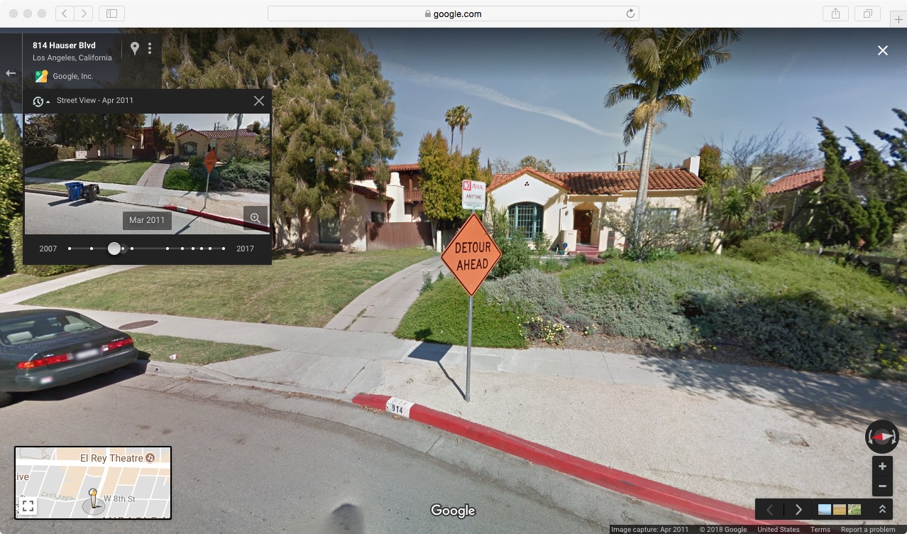
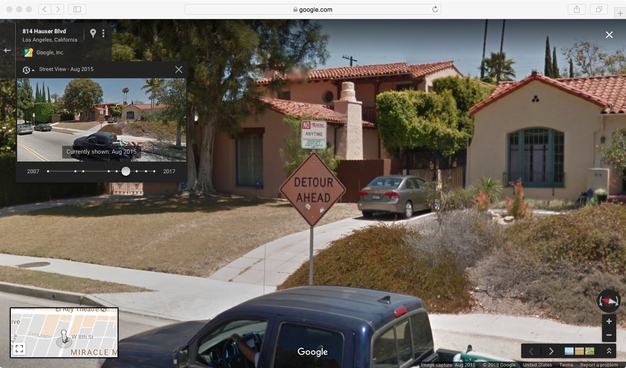
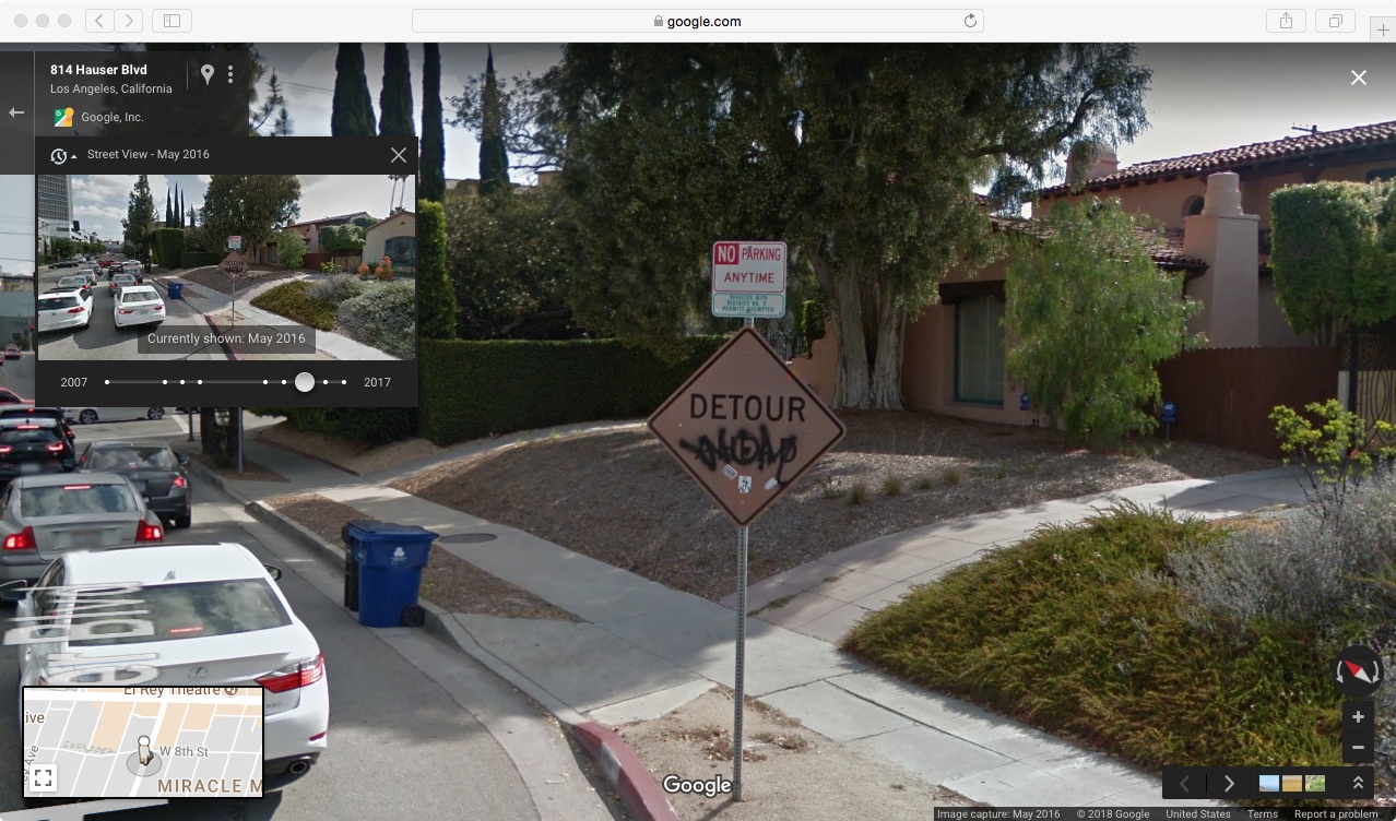
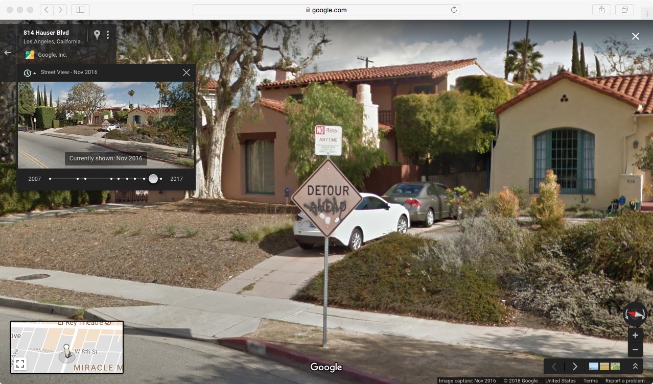
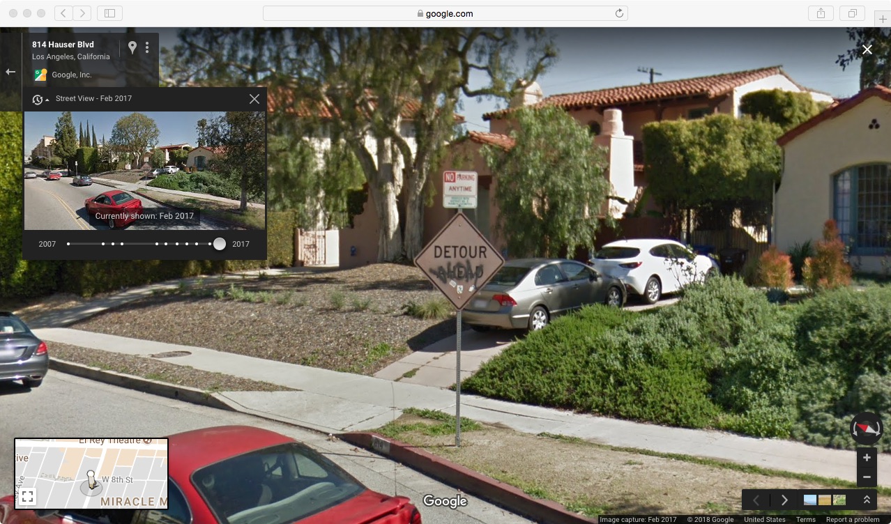
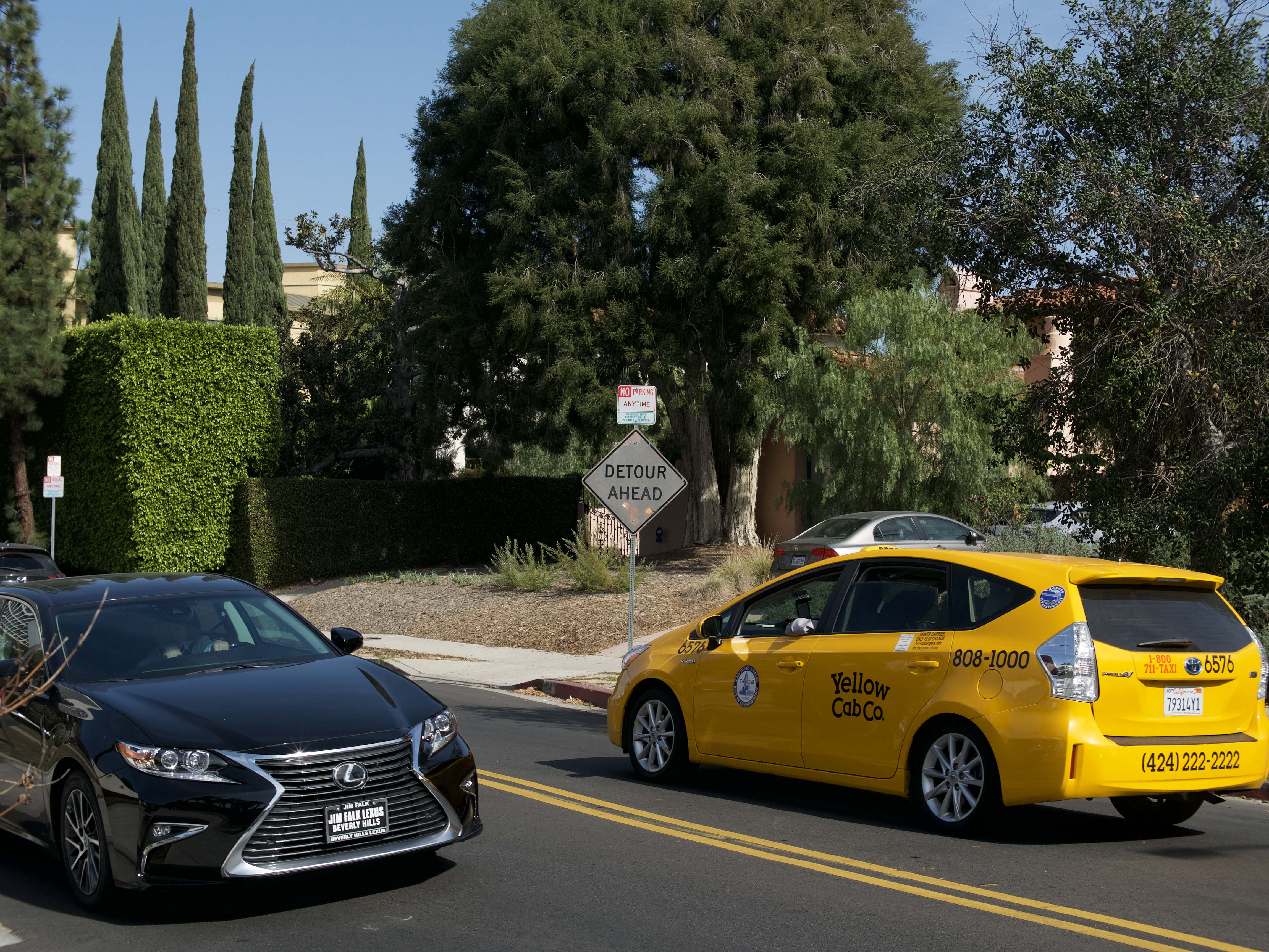
The interruption in question that spurred this narrative overlay in passing was/is a "DETOUR AHEAD" road sign, ostensibly installed to announce a forthcoming, temporary construction zone. This particular sign however had been installed for such an inordinate duration that the bright orange background color had faded to such an extent that the sign itself looked as if it were lifted from a yesteryear fictional narrative during the period of black and white motion pictures set in an otherwise uncanny, technicolor, present-day reality.
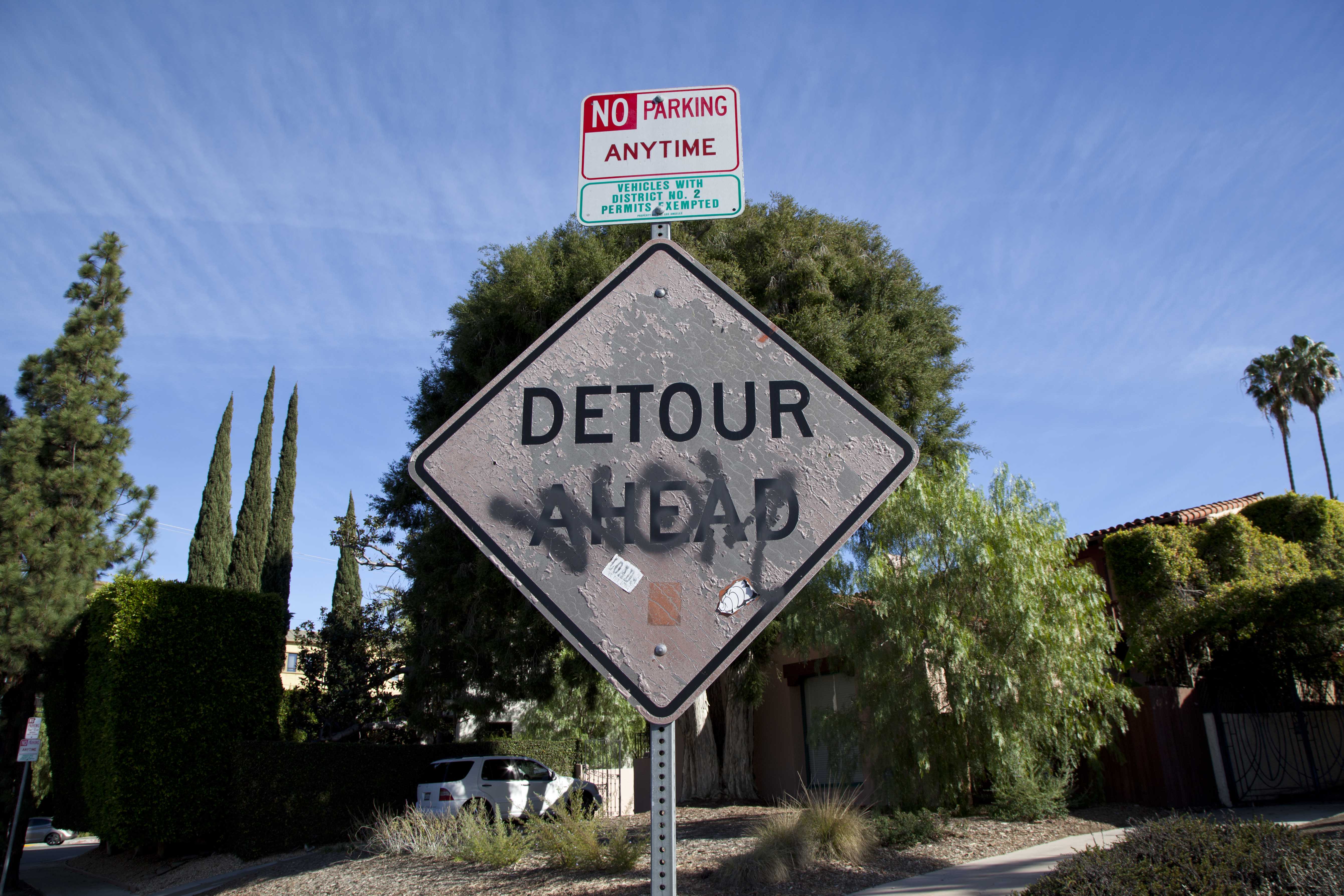
On closer observation, the sign itself was a rather complex example. Prolonged installation under the Los Angeles sun had depleted the orange of its vibrance to the point of it looking radically gray by comparison, bleached, with the black lettering in contrast remaining crisp and bold. A few small stickers previously adorning the lower portion of the sign, markers of pedestrian interaction and an inferential indicator of neglect of long-forgotten deinstallation, had been recently peeled off through a graffiti removal process to reveal preserved fragments of the vibrant orange that was protected underneath these adhesive fragments as preservationist buffers.
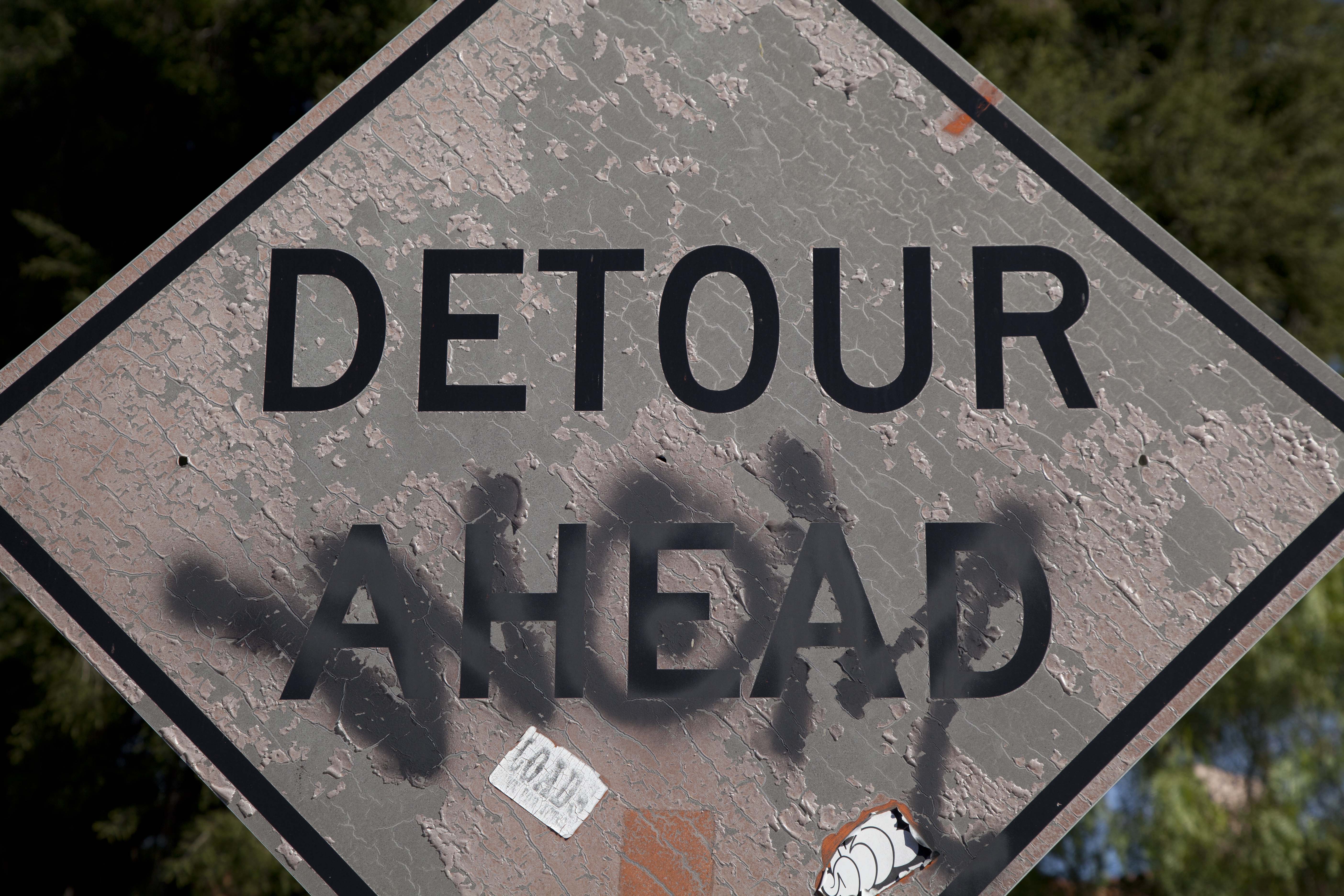
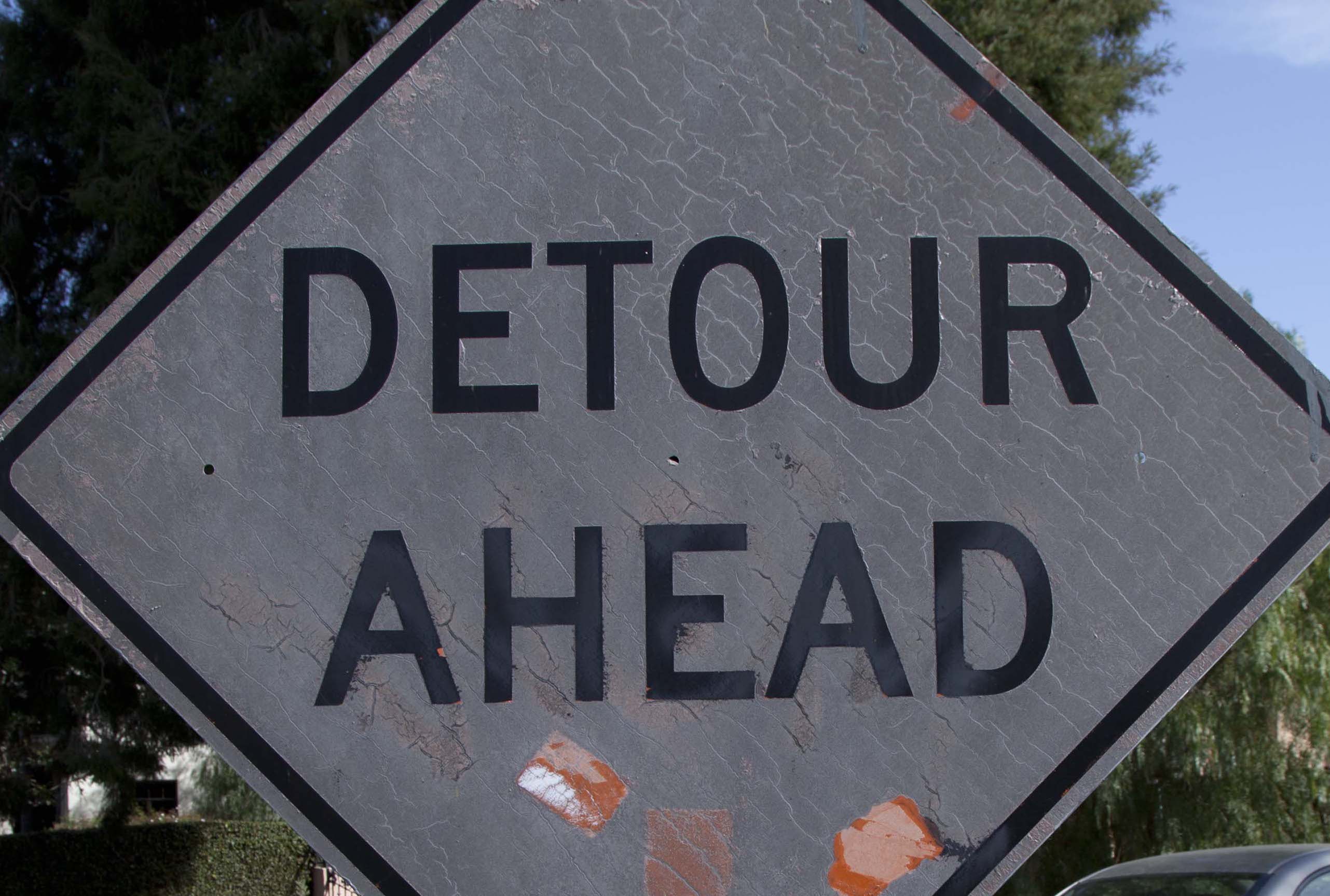
Additional details were visible: cracked remainders of a once protective top coating remained present beyond-vertical reach as well as two gray drips carrying over from the backside of the sign, the result of a paint roller buffing graffiti on the sign's verso side. This slapdash paint job curiously three-dimensionalized the sign's objectivity, rather than maintaining as an otherwise two-dimensional imagistic surface and symbol while the graffiti was previously visible. Was it such physical interaction with the object which led to its reduced flattening by a privately contracted graffiti cleaning crew? In what ways did the effects of this solar bleaching and these various social layers of cat and mouse now complicate the reciprocity of the sign's use? Was the installation of the sign operating on a different temporality than the suggestively adjacent construction work, vaguely stated as being "ahead" while not immediately visible? Were drivers easily neglecting the sign due to this purging of its optical high-impact orange qualities? Does this call-to-attention begin to function differently when considered in a static manner and faced directly rather than in a peripheral, passing glance while driving?
During site-visits, I had been continuing to turn "Killer on the Loose" over and over in my head, as phrase, as cinematic trope, as artwork. I found it necessary to engage in a deep course of study to become better informed of the spinning newspaper trope/gag and its historical evolution of use in cinema into television towards a gif: breaking events within a fictional frame causing a recursion in meaning.
One significant detail that is edited out of this painted artwork, though upon closer consideration is actually displaced onto the viewing public, is that whereas when appearing on-screen such a paper starts small (representationally distant) and spins towards the viewer, becoming larger and near-full frame (psychologically dominating over the seated audience), the painting by contrast toggles this "growth/approach" of the paper while it spins onto the onus of the viewer in gallery who must actively engage the rotating allure, moving from across the room at some distance towards the hanging, spinning image in attempts to read its content. The rotary motor never stops while the painting is on public display. Whereas in the movies, the newspaper comes to a passive, sitting audience, the inverse is true with the physical manifestation. Such prescription demands a non-passive, beyond retinal approach, filling an optical field of vision with the representational newspaper in the very act of walking towards the moving image for closer viewing. I recognized a feature of the exhibition architecture would hinder this steady pull towards the spin, a built-in, glass-topped counter, which served as the refreshments bar.
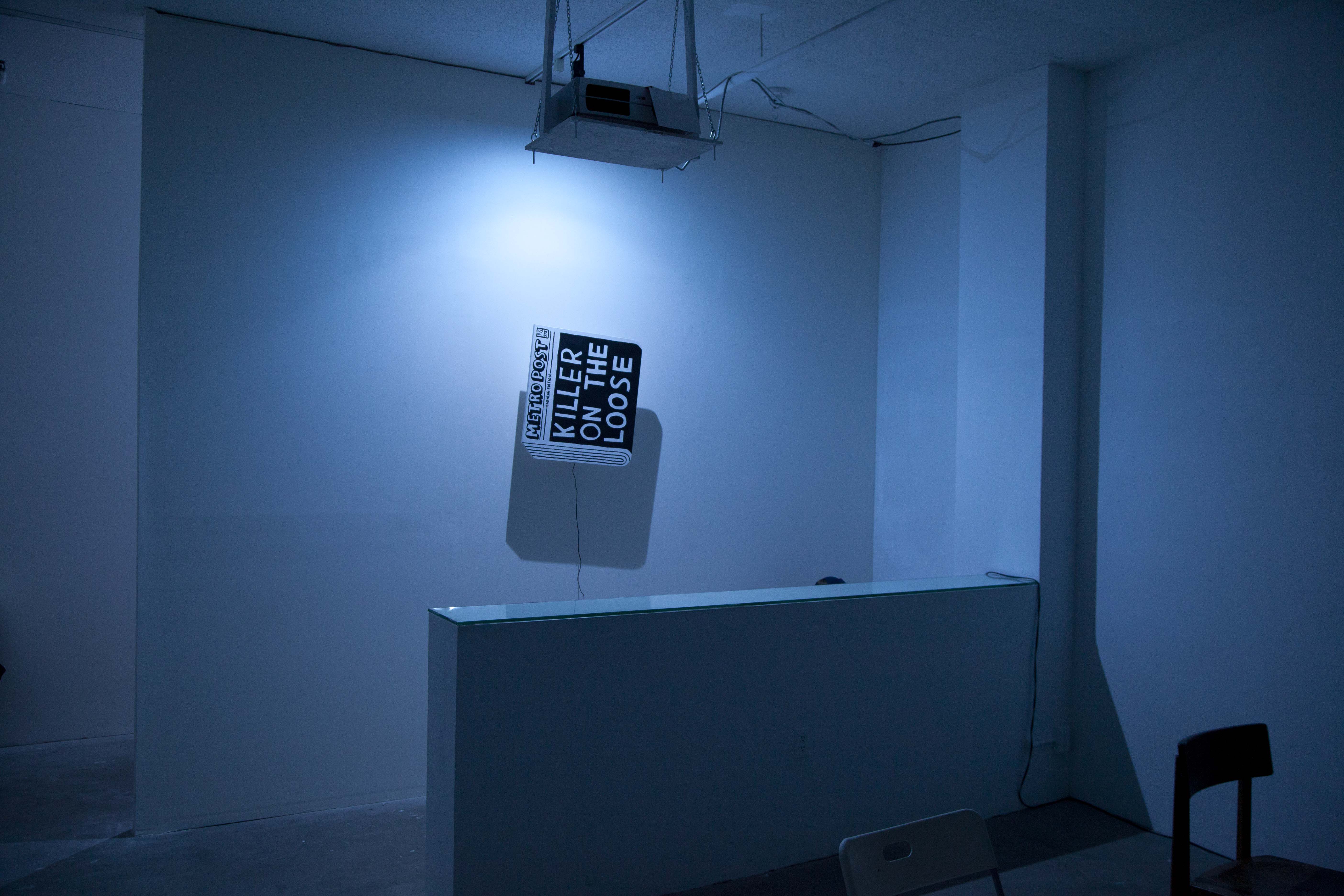
With the partition wall built four feet in back of it, this created something of a terminus, if not an outright impediment, for an elsewhere smooth forward facing approach for a gallery viewer pulled in by the rotary painting. In effect, this architectural interruption of the bar disallowed "Killer on the Loose" from reaching full frame in eye. Cast in blue light, the painting never left its position on the wall, contextually binding it to its space of display and denying any supposedly autonomous, void existence as regularly portrayed through the trope. By extension, certain details such as "Evening Edition" began to fall in line associatively with the time of the scroll event itself, occurring from 6 to 10pm. Although, such fine textual details could not be ascertained due to the momentum of the spin. In this case, the architecture heightened the stationary degree that the painting maintained in constant motion, which would cease, by contrast, when used in the movies as plot-progression device upon full view/zoom. The physical manifestation of this cinematic trope/gag being resolutely static (hanging on the wall) contrasted its resistantly non-static and auditory incessantness as perpetually a case of non-static motion. This made the content of the headline and great "paper" a challenge to read. Up-close viewing was only feasible from oblique angles requiring an individual to step between the partition on which it was installed and the glass-topped counter upon which drinks were being served prior to the screening. This naturally brought on its own minor interruptions to the concessions service.
I decided to compliment this imposed stationery state of "Killer on the Loose" via referential inversion: The DETOUR AHEAD sign in question would toggle in as the central content in a film that would be set at a glacially slow zoom-out. Adopting an inverse of spatial progression through an extended yet finite duration, this interlude of a screening would provide time for an audience to gradually familiarize with the situational context of the sign's location while remaining inescapably conscious of the tactile and physiological conditions apparent while watching as a viewing audience during the screening. The discernible content of the sign attempted to address the cinematic referent of a world-building, plot-driven language however appearing at odds with its greater environment once both were visible in frame. Providing prolonged exposure for steadied observation of the non-fictive surroundings contrasted the propagandistic sensationalism of a newspaper being "tossed" yet never reaching us. What would seemingly begin as a black and white filmic image would slowly clarify through expanding margins as peculiar signage, as if transitioning from an illusionistic black and white picture into a discernible circumstance brought on by a type of over-exposure in an otherwise colorful situated reality in motion.
Certain qualities most closely tethered to a history of structuralist film-making were consciously apparent from the beginning of conceptualizing this contribution. Having never worked concertedly with film/video or moving image for that matter, I opted to not make circumstances overly complicated. This would be a learning process of which I was prepared to be honest in regards to direction. Filmic structuralism seemed a sound methodology to adopt as a first-timer. Perhaps everyone's first attempt at film-making is by nature more structural inquiry than anything else. If this is not the case, then perhaps it should be for the sake of exercise. Such tenements of acknowledging the apparatus were preferable because the indicative dimensions of self-reflexivity in structuralism are conducive to a inquiry-based learning of the limits in a first production.
After attending the screening, a longtime colleague took it up himself to remind me that structuralism took place in a specific moment in time and is only ever of that period. I am not certain I entirely agree. If this critique means to claim that a type of mannerism is evident by comparison to now-canonical filmic experiments of the 1960s and 70s, than the interpretation is resolutely of the mind that the zoom-out was arising from an aesthetically-guided, formal motive of aspiring that the film be deceptively considered as part of a timeframe other than of its own making. [Far more needs to be written here in regards to situating a discussion considerate of examples of that period which utilized a controlled zoom, most notably Michael Snow's "Wavelength".] With the spinning newspaper in mind, I came to ponder whether a structuralist approach could be described on a fundamental level as a dislocation of such plot devices and interludes; by the very act of separating them from the surrounding narratives constituting devices of another kind, critically complicating those very fictions through emphasizing the problems inherent in service of rendering an escapist illusion of narrative film. Instead of aiding a narrative by way of deceptive supplementation, the liberated content through casting light upon the underlying structures of cinema becomes an addendum, questioning its labored service within such narratives. Structuralism as a means became a step towards current day from the noir era only viable in the isolation of a close-up.
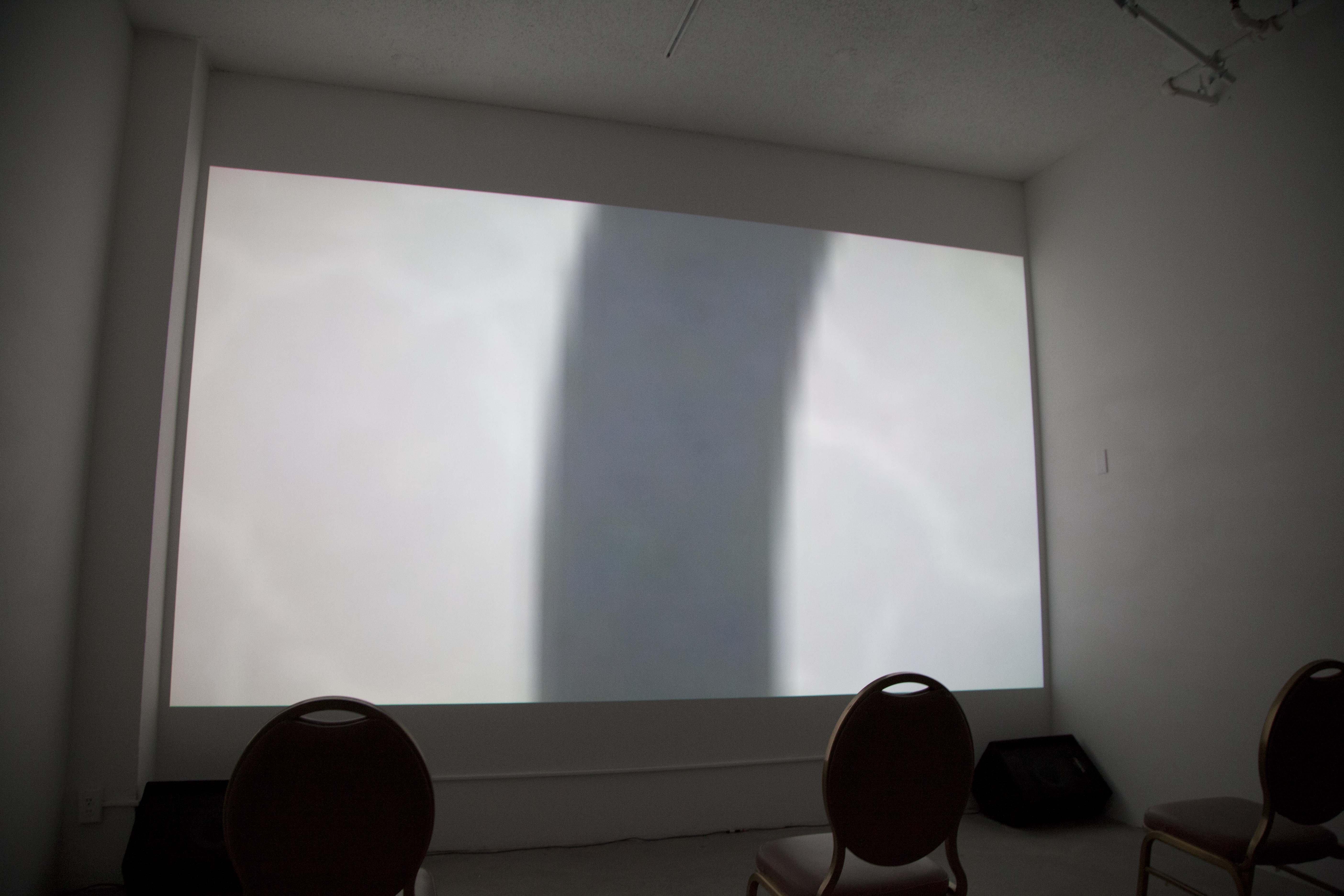
The film begins with the black of the "O" in "DETOUR" filling the screen, edge to edge. This collapsed distance will prompt the first of three embedded reveals. The black interior of the letter initially appears by association, though divergent in appearance, as black film leader, traditionally preceding (leading) the first reel of a film. Here, not until the shot progresses does recognition that the image has already been present occur. To technically achieve this IECU (incredibly extreme closeup) proved challenging. An earliest interest was to set this as the start of a steadily paced in-camera zoom over many minutes time over a single shot. After much effort and consultation with a number of colleagues working both in the art world and film industry with no practical solutions under deadline, a decision was made to apply a digital zoom to the static shot in post-production as the glacially slow rate of speed desired of rotating a lens proved insurmountable to achieve considerate of the production schedule. As an outcome of this, the HD digital image with applied digital zoom became technologically of its time rather than trying to masquerade as of a prior period when reel film as material substrate was structurally examined as an accepted limit. The historical precedence in the cinematic transition from black and white to technicolor extended attention to the trope of the spinning newspaper as yesteryear plot-device as structuralist film-making served as a self-reflexive acknowledgment, laying bare the produced illusion of the moving image under stages of reveal.
A byproduct of the compression incurred by the digital, post-production zoom, beginning deep within the image content constituted a difference from a smooth black of digital film "leader": the extreme compression along the digital grain of the moving image produced what could be described as a highly active, visual noise at close range. Paradoxically, this dynamically animate beginning is the most illusionistic, akin to film stock leader running through a proverbial reel to reel projector. A rushing multivalent sound is audible from the start, possibly waves, in actuality automotive in source. The sound of birds and other ambience enters the gyrating, compressed abstraction at the fore. Fifty-four seconds in, grayish margins enter from off-screen, left and right. It is not yet apparent that we are within the interior color of the "O" whose limits are the first signs of an edge within the image. At one minute forty seconds, flashes of light and color pass across the screen, momentarily changing a dark image to a searing rose, gold, red, white, then green before returning to the liquifying grain under states of intense agitation. At one minute forty-eight seconds, blue for one second, then white for another. The directionality, if any, of these colors is difficult to perceive; they come as bursts.
As the film precedes, these gray margins grow wider. At three minutes ten seconds, a song is audible among the sporadic mechanical noises of engines humming. The song plays for twenty seconds.
A slight curvature is beginning to present at the top of the image, the seeming margins drifting in parallel to the right. Intermittent left-right shaking of the entire image occurs. A car honks at four minutes twenty-seven seconds, cutting the tension and becoming the first contextual marker. Any remaining waves at this moment are most discernibly emanating from cars. At five minutes twelve seconds, the lighter margins are now each equal to the dark center. At five minutes thirty-three seconds, a secession of three quickly moving cars are heard passing but are not respectively seen in frame, then a fourth rushes across the screen, left to right, bluish. At five minutes fifty-two seconds, blue again.
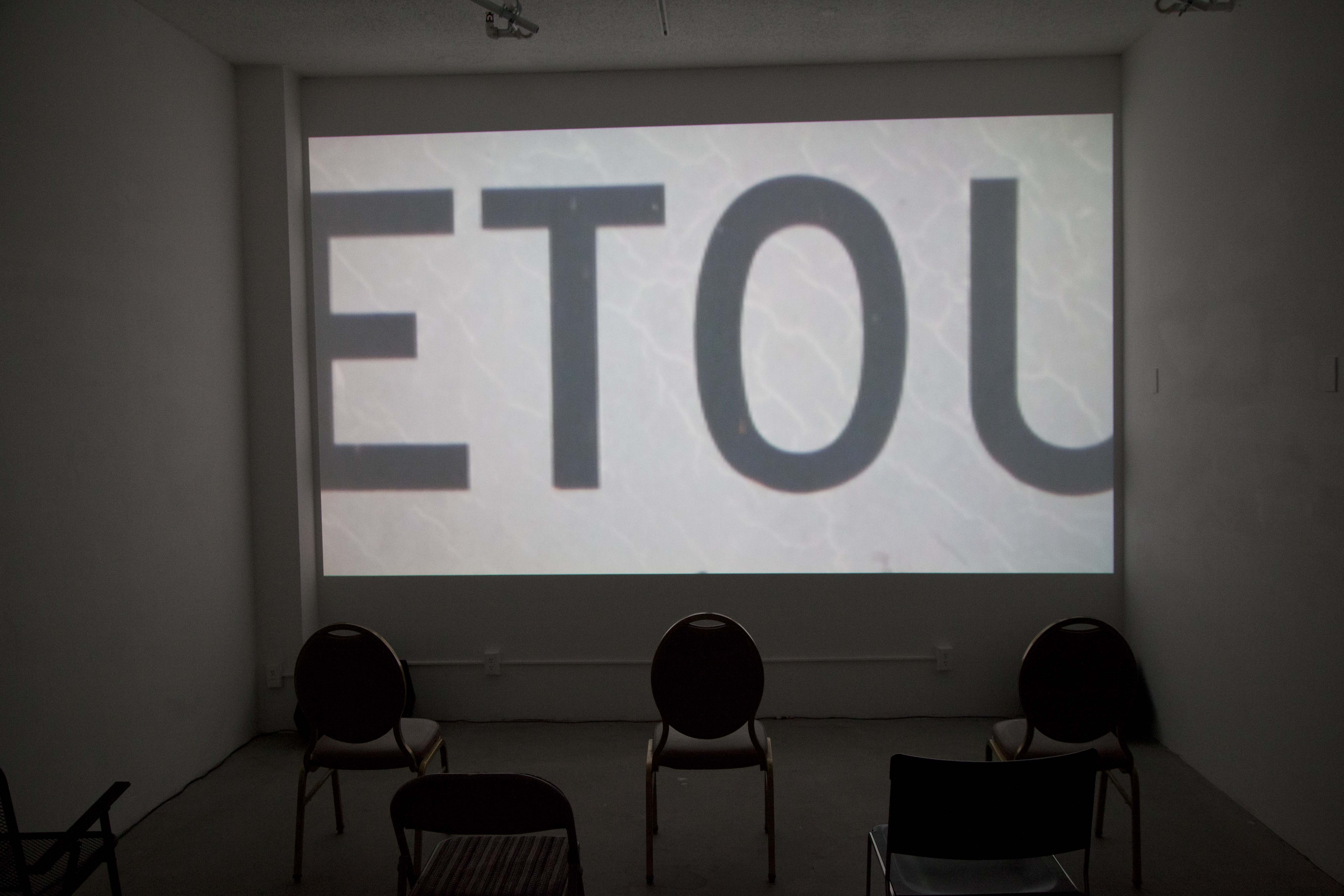
At six minutes, something like veins or cracks become visible in the expanding margins, eventual these lines signal as the internal dilapidation in reciprocity of the street signage. The notable shaking of the image continues and by this time the zoom-out directionality is apparent. The shake could be thought to be from vibrations affecting the camera, passing wind stirred by flow of traffic, for instance, but this proves to be an incorrect assignation in time. At seven minutes fifty-six seconds, a vertical line of similarly dark color enters on the left. By nine minutes seventeen seconds, the edges of the letter "O" are unmistakable. Subsequently at nine minutes fifty-six, "TO" is readable, then "ETOU" at ten minutes forty-three (et / ou: "and / or" in french).
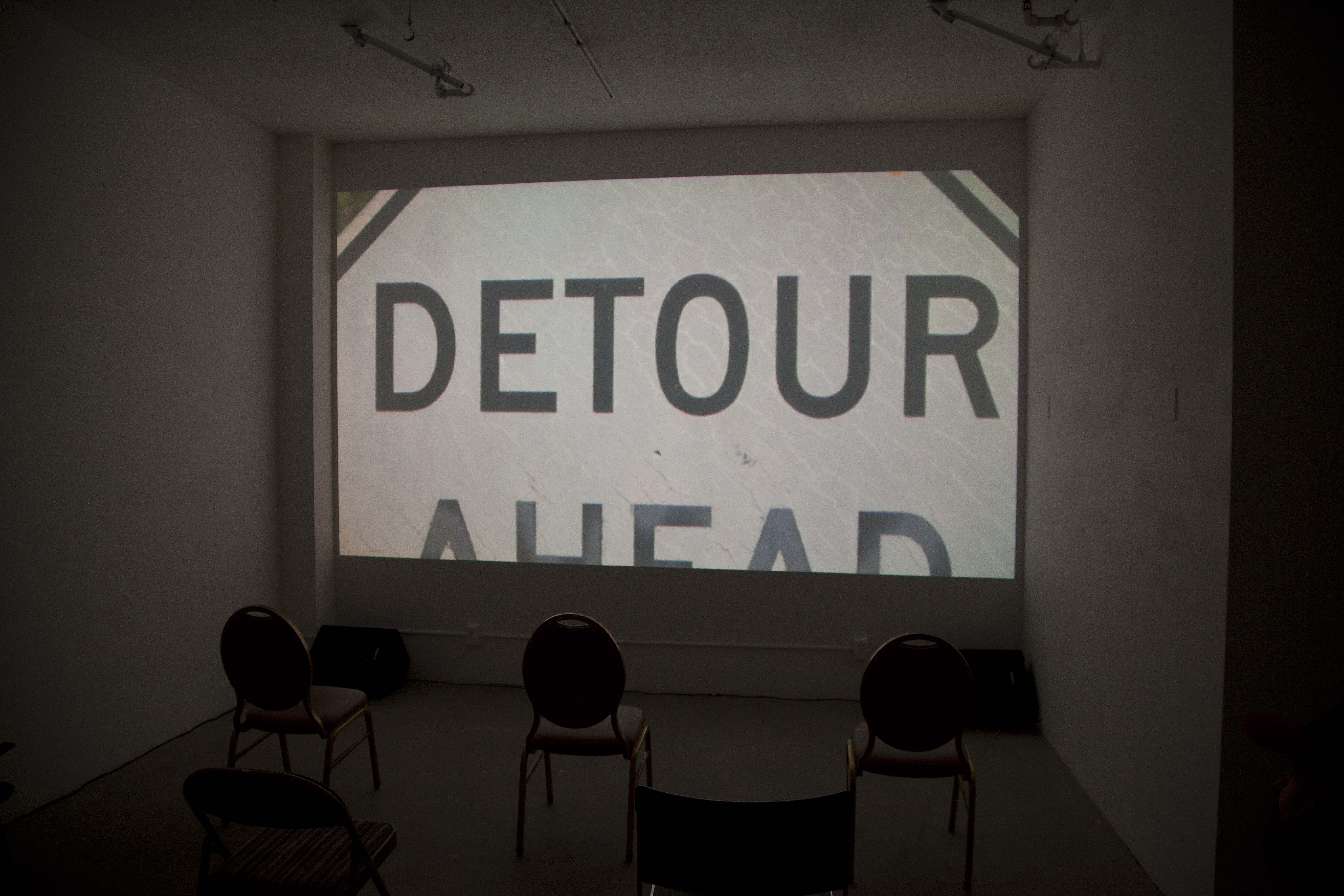
The zoom pulls out to show "DETOUR" at eleven minutes three seconds. For a brief moment this word might operate in the way a title screen would in a black and white feature as the first fully formed and readable content of a narrative to come. "Detour", a 1945 film noir directed by Edgar G. Ulmer, is momentarily cited (trailer)(full film, note title sequence)(more to be written). Only shortly after comes the second reveal when a fragment of recently uncovered orange in the top right edge of the sign comes into frame, providing clerical confirmation that the central content has always been in color despite appearing grayscale via a previously hypothetical digital desaturation doctored in post-production. Proceeding further, the image presents the diagonal top edges of the sign demanding immediate and necessary adjustment to inter-image spatial relations brought on by newly establishing layers of depth.
"DETOUR AHEAD" becomes fully present in frame: the first time to process this language in what was seemingly a desaturated image and now shows as central in a perplexing piece of signage, which albeit flecks of color otherwise could be mistaken as part of an earlier filmic worldview. Is Murdoch/Trump et al.'s youth, that "Make America Great Again", "Leave it to Beaver", not to neglect the palette of "The Twilight Zone" located in this image, metonymically? Amidst a high-noon, vegetatively lush, narrow albeit heavily commuted residential American thoroughfare, lies a sign of warning, as if pulled from pre-technicolor yesteryear and yet residing there all along. Is this propositionally indicative of a near future interruption to be averted?
The film progresses outwardly through three sequential shots. These sections mean to frame at the point of reveal in full respective expanse: 1) signage as grounds both public and private (the ADT security sign in front yard, comes under analysis in the part ii installment in scroll), 2) a residential backdrop, grounding the sign in a municipally maintained parkway, and 3) the broader civic landscape of a commuter city under perpetual maintenance, displacement, and revitalization.
The first shot begins in the language of the letter until eventually arriving at a close-up of the diamond sign situated at the edges of the rectilinear frame. The angle of the lettering compared to the angling of the diamond shaped substrate contrasts the justified relation between headline and paper in parallel to each other.
The second shot begins precisely where the first leaves off as the zoom moves out to show more of the immediate surroundings, all the while with the grayness of the signage remaining central as it further becomes situated in a neighborhood, located outside a private residence that do to the angle of its installation is not the residence as backdrop to the corresponding street address. The sign loosely screwed to the pole rocks in the breeze. A Los Angeles District 2 parking permit exemption sign becomes visible, installed above the temporary road sign. Further above, a "NO Parking ANYTIME" sign. A pedestrian's head bounces by the bottom of the frame. The first visible individual. A parked car in a driveway remains stationary as the street is resolutely non-static. Cars incorporate, more and more, into the frame, driving at speeds which sometimes appear contrary to potential out-of-shot construction work as well as delays incurred from it. The speed of the passing traffic shows scant indication of the sign being heeded by drivers. A reflection in some halted car windows shows a white modernist skyscraper designed by Charles Luckman in 1965 (more to be written).
This second section zooming out arrives at its terminus at the distance by which the pole which grounds the sign is in full view at the curb line.
The third shot begins were the second left off and proceeds to move gradually across the street to eventually show the proximity of where this sign stands some thirty feet from an intersection with traffic signal at its corner, reflected in the left edge of the image, clarifying the signal being the cause of fluctuating car speeds.
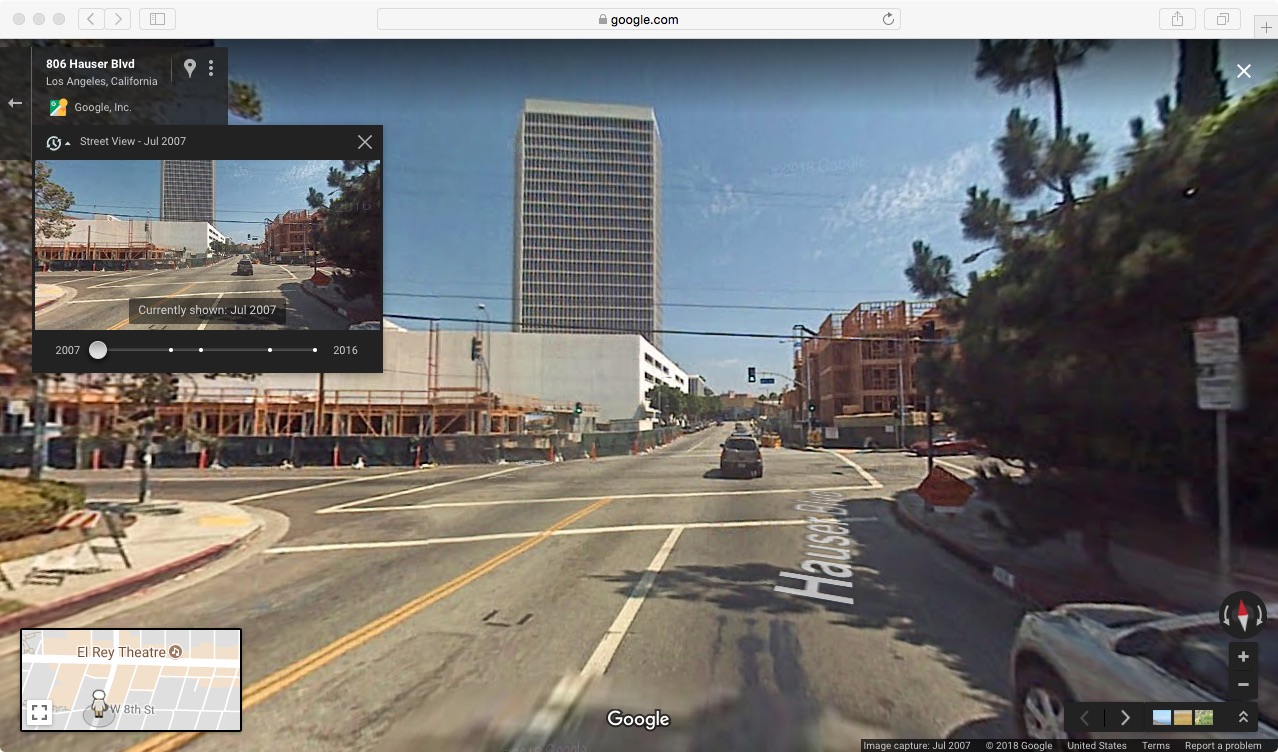
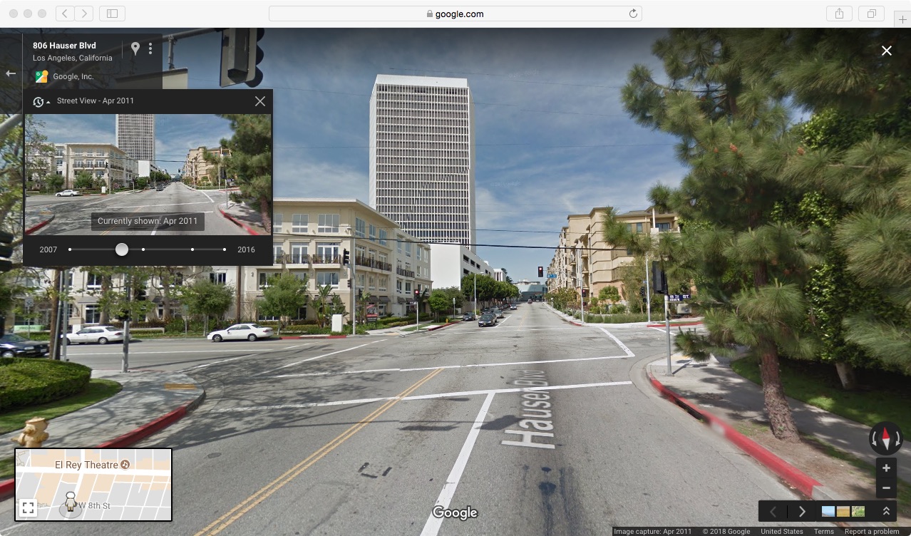
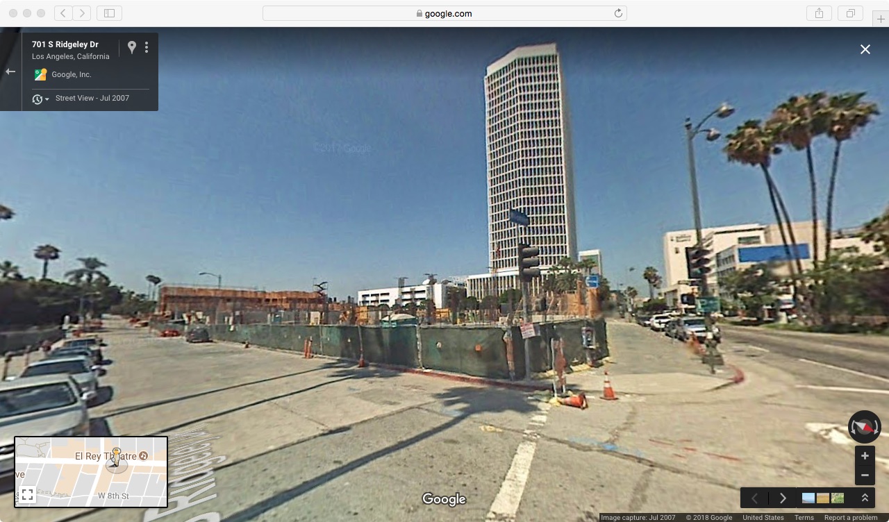
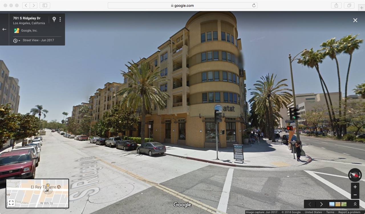
The cars move left to right and right to left across the frame. The surrounding vegetation moves in the wind. The sign itself rocks in minute ways back and forth, loosely bolted to its plinth. The zoom progresses out. Three visible pedestrians pass along the sidewalk behind the sign in all. Research has shown that the origin of this sign stems from a large construction project, began in 2007 and completed in 2008-09, of a multi-unit, mixed use complex at the intersection, visible above the tree line by the end of the third zoom.

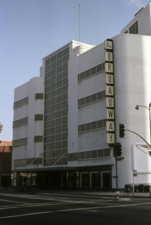
The luxury complex (5600 Wilshire) is sited in a lot formerly vacant since 1980 in which the previous building was torn down just before receiving historic preservation status as one of the first department stores along what became dubbed the "Miracle Mile" stretch of Wilshire Blvd, the first significant decentralization of commerce outside of downtown Los Angeles in the history of the city.
News articles (1)(2) prior to the 2007 development, note that the empty lot had been oozing tar since the 1980 demolition, causing sufficient irritation for adjacent homes and businesses do to the stench of underground methane offset. The La Brea Tar Pits are two blocks west on Wilshire. (Develop account of Tar Pits relative to the subterranean Salt Lake Oil Field, Rancho La Brea transition into Hancock Park and “Museum Row” relative to oil derricks, car culture, and the discovery of ice age fossils preserved in the tar.)
By 2018, the efforts to extend the city's metro subway system "Purple Line" directly under this Miracle Mile expanse of Wilshire Blvd, past Museum Row and onwards into Beverly Hills was already underway. The Los Angeles County Museum of Art, by this time had introduced by surprise climax to an exhibition chronicling the campus’s architectural evolution to-date, a new master plan, despite subsequent public outcry, the future of the physical institution that would begin with the demolition of the remainder of the campus’s original three structures designed by William Pereira as well as a 1980s add-on designed by Robert O. Anderson. It their place remains to be built an elevated, single-story structure, designed by Peter Zumthor, that would span over the boulevard with a hurried completion date intended to coincide with a scheduled metro stop opening directly across from the campus’s central entrance in 2023. Detour Ahead.
The length of the film was determined by adopting the measured distance between the projected image and the installed partition wall, twenty-three feet, converted into an equivalence of minutes. By analogy, the film takes twenty-three minutes to travel twenty-three feet in its intended space of projection. Because the "Killer on the Loose" work functions in a traditionally autonomous sense as an art object, its placement on the partition affected its discernment and interpretation. It was the scroll series by extension which provided the grounds for the representational newspaper as an element, metaphorically extracted from a cartoonish, hypothetical narrative in which it functioned as a specific plot device. The physical conditions in scroll succumbed less to serving as narrative as a dissonant reality in which the proverbial paper's place was part of a spatiotemporal event rather than reporting on one. With the film conceived to function as interlude, considerate of the curatorial structure and conceits, the twenty-three minute duration accounted for passage across the space in which the attending public was located, between the hybridized static/non-static works simultaneously on display.
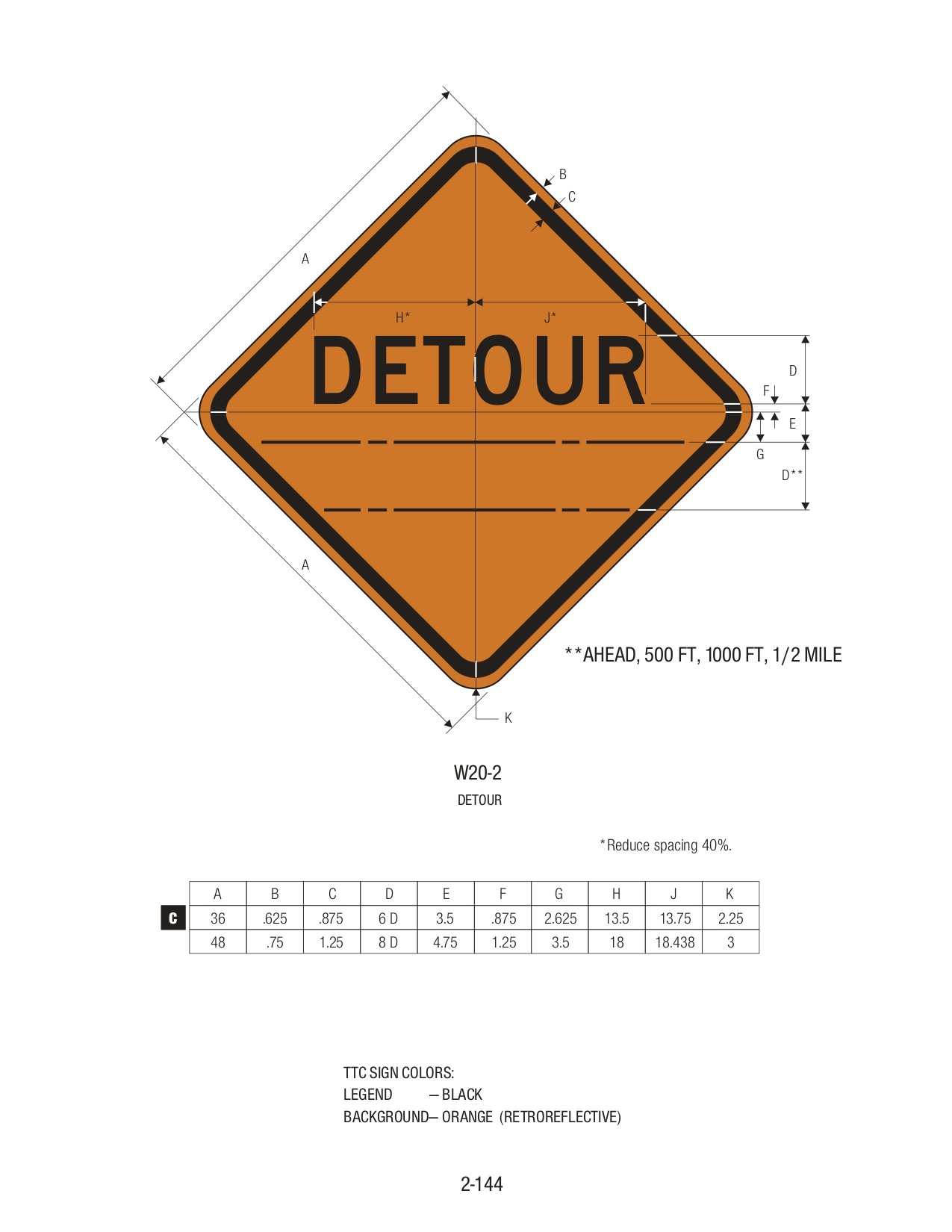
After the third zoom sequence concludes, a white text appears on black ground, as another approach to paralleling the color scheme of "Killer on the Loose". This text consists of excerpts from sections and sub-sections relative to "DETOUR" signage in the "Manual of Uniform Traffic Control Devices (MUTCD): Chapter 6F Temporary Traffic Control (TTC) Zone Devices":
"Section 6F.02 General Characteristics of Signs 02 The color for regulatory signs shall follow the Standards for regulatory signs in Table 2A-5(CA) and Chapter 2B. Warning signs in TCC zones shall have a black legend and border on an orange background. 05 Existing warning signs that are still applicable may remain in place.
Section 6F.19 DETOUR SIGN (W20-2) 01 The DETOUR (W20-2) sign shall be used in advance of a road user detour over a different roadway or route. 02 The DETOUR sign shall have the legend DETOUR, XX m (FT), XX km (MILES), or AHEAD."
In this case, under consideration of a situated context, applicability remains a central question.
Thereafter, credits begin in listing the property address on which the sign is installed on the parkway in front of: 814 Hauser Blvd Los Angeles, CA 90036. (More to be written on the use of citation also addressed in part ii.) Consider the film, which has no authored title, as a protracted title sequence taking up the entire run of the film-work itself, contradicting the introductory function of a title sequence, followed by post-text and credits, as denial of a narrative fitting in frame.
While "DETOUR AHEAD" does sound a great deal like a film noir detective caper title, this film is resolutely not film noir, stylistically speaking. (More needs to be written on where the noir association comes from. In this case, it remains lodged in the brief peripheral timeframe of the lookie-loo; durational viewing head-on clarifies the abrupt nature by which an association can be too-quickly blurted. I remain curious in how Thom Andersen's alternate category of film gris situates a counterbalance to the referent as well as to structuralist filmmaking through proposing a critical refrain that could be called gray structuralism. The rosy antagonist we see in the structural filmmaker canonized into the story of cinema. The ethos in direction here are more convivial to film gris applied through a structural exercise through a contemporary lens. Is this film making a case for neo-noir in the grey spectrum?
This film also functions as a typographic study. Sans-serif use in construction signage (more to be written). PT Sans, an acronym for 'Public Type', was used to set the excerpts from the Manual and the credits.
Because of display conditions, "Killer on the Loose" remained spinning and thus also audible during the screening. This produced a face-off of sorts between the non-static language of "yesterday's news" (and yesteryear's cinematic trope) represented in the medium of kinetic painting and the static language supplemental to infrastructural, civic change surpassing the duration of its signifying construction as the focal impetus of a film. That "Killer on the Loose" remained rotating during the screening also provided an ever-present reminder and additive audio layer to the room, mixing in real time with the film's ambient audio of the street while those in attendance turned to parallel the cinematic plane. A curious by-product of this entailed many people turning on occasion away from the film, giving momentary attention back to "Killer on the Loose", which was effectually lit by the bouncing light of the film traveling twenty-three feet back across the space.
In perhaps paradoxical distinction, an analytic perspective of a reality would entail zooming in for more detail whereas here an image begins in abstraction and upon zooming out in each sequence, the central subject progressively advances in contextual focus. The circumstances of digital zoom versus in-camera entails that the vast majority of the image is out of frame at the start because of intense magnification into the pixel level of the image with a gradual expanse until the image is one hundred percent in view by the end of each sequence. Only for the briefest of moments does the full HD of each sequence present on screen before the subsequent supersedes its place.
What questions remain after the screening has concluded? Has the construction actually ceased yet the temporary signage announcing it forgotten? In what ways does this comment on Los Angeles/American infrastructure (road repair, etc.) that has been touted in current politics as promise yet not addressed through action? What impacts do re-development via gentrification have on the genealogy of a sedimentary neighborhood? Does the sign remain quasi-indicative of the long term civic attempt to interconnect Los Angeles through underground metro line extensions as offset to one hundred years of car culture: the Purple Line scheduled to pass through this stretch of Wilshire in the next decade, the anticipation of which brings about the speculative developer to build on unstable bedrock or the subsequent luxury living commuter in residence? What does the word "detour" begin to mean when we dwell on its stoic (non-spinning state) as it slowly becomes smaller and smaller in the image while an establishing context in color frames its central (dis)position? What does taking a detour mean in our current socio-political moment? More consideration required in relation to the word "detour" and the concept of detournement. What does a long-forgotten alert, drained of its intended visual register and optic impact mean in this day in age when twenty-four hour, rampant character-limit drawn headlines serve as distractions from what lies ahead?