This installment was the second in a two-part engagement in the scroll serial. It is improbable that anything other than being responsive to an initial occasion, given the circumstances of returning to the same site and peer(s) in such a short period of time, roughly one month, is feasible when the condition of shifting positions from the cinematic to the painterly is also asked of participants. This was a case in developing a means of addressing the prior event in terms of its previously included content, dedicating further attention to architectural details of the venue as setting, and an opportunity to zoom in to certain matters embedded within the film produced for part i, which were in that context resolutely in the background of the image, and perhaps by extension less memorable in retrospect. A driving inquiry for me in part ii was a consideration of how a citation functions as an example.
Matt Town, who programmed the series, publicly described series as “an eighteen week palindrome. The participating artists, writers, filmmakers & painters have been given the opportunity to negotiate the dynamic where painting faces film and film faces painting. I've considered a static/non-static framing device as a democratic space leading to collaboration, how the two confront each other, or "marry."
With predetermined participant pairings as an attribute of this palindromic structure, each pair, through accepting the invitation to participate, obliged to a followup event, a return to the scene under the guise of a role reversal. For part i, the explicit selection by Town of an existing painting from Keith Rocka Knittel relegated my attention to its designated compliment in this context, film, a medium I had not directly worked in prior. In part ii, the inverse arrangement asked for an approach to a medium I had not directly worked in for more than a decade. While I have previously noted my general aversion to medium-specific curatorial conceits, it was through having by this time a multi-year, ongoing dialogue with Town that more substantive nuances between the dynamics he described in only a cursory manner in his text is what compelled my involvement. The invitation was accepted as a challenge to address the particularities of these mediums as two languages, bilingual to each other, after countless hours of discourse together had strived to give form to their co-responsiveness as much as to their divergences.
Each event in the series was a one-night only affair. Falling on Tuesday evenings from 6-10pm, it ran from January 9 - May 8, 2018. The return to the scene in part ii for Rocka Knittel and myself occurred on March 27. Town would send out monthly announcements through an email list that presented a calendar of all events and named pairs scheduled for each week, evincing the palindrome described. The named pairs followed a formatted order of “(person assigned to painting) & (person assigned to film) with the followup event listing the two names in alternate positions around the static ampersand. Five announcements in total were sent over the duration of the series with each being distinguished through the added listings of specific runtimes after each named pair for that particular month's worth of programming. With the second name in each listing being tethered to filmic matters, the detail of run-time for each event varied wildly as these durations were attached to film and video projects that, on the majority, were made prior to rather in response of the series. For example, the three weekly events in the month of March leading up to the part ii I took part in were listed respectively at: 1hr 5min, 2min 46sec, and TBA (to be announced). In the instances of a feature-length contribution, it would screen once during the night, which usually started a half hour after doors opened at 6pm. For shorter pictures, there would occasionally be a second screening in the night if attendance was staggered over the four hours and a second wave or an explicit request was made by a late comer. In most cases, accommodations were courteously obliged. While some in attendance remained in the space for a period after a given screening, when internal lights returned to an "on" position, the majority of visitors took their leave shortly thereafter.
One aspect I had been mulling over in my weeks of attendance leading into the month of March was the offset in attention between the painterly and the filmic planes which seemed in part localized in each event around the runtime of the moving image in the space. The extent to which the attention and responses to painting located upon its assigned wall were compounded by a position behind a makeshift bar serving curated weekly refreshments inspired in some manner by that occasion's pairing.
Already described in the part i notes, this waist-high impediment, a station for complimentary libations before, during, and after the screening situated any engagement with painting as one looking past the bar accoutrement and bartender, Town himself. To what extent this spatial organization of built-in architectural features and their assignations cast painting as "behind", as decoration for this bar as vignette, as its own site of attention, in baring witness to a drink being mixed and served, lingered as a residual consideration for me. Likewise, because the runtimes were listed in the announcements and paintings are not generally known to list an discrete view-time, the attendance on average used the half hour before the lights in the space dropped to greet each other, converse, and mill about before a distinct reorientation of everyone took place with all eyes on the filmic plane for as long as its picture asked them to hold focus. With much to process once a video/film screening concluded, any focused conversation generally engaged in the afterimage of what was just moving, before people departed for the night.
In the case of our part ii, I had asked Rocka Knittel as to how we might approach this return to the scene. In the first iteration, his choice was made for him by the curation. This second pass appeared differently generous, a different approach forged through paired communication could occur. Town, in this instance, was not selecting any prior work realized by either of us for import into this second iteration. In my case, the selection of a prior example would be quite unfeasible by Town who had only heard tell of an earlier period in my praxis when painting was a chosen modality. By this time it was more fabled than part of a backlogged catalogue readily available to display. Rocka Knittel suggested that I take the lead by submitting something under the guise of painting as a prompt so as to mimic the primary/secondary dynamic Town had induced in our prior installment. I accepted this inversion to provide him something to respond to in any manner he saw fit relative to filmic framing.
Extending from observations which developed into my contribution for part i, entailing that any response would need to simultaneously engage both the "Killer on the Loose" existent work from Rocka Knittel as well as the curatorial selection of it by Town, in addition to the rationale of our very pairing and the various measures of the space between the facing wall planes, the particular challenge in returning to these conditions was reconciling with all that had come before. The description of two mediums, static and non-static, facing each other, was not so much a dichotomy as it was a dialectic to react to and work from. The rotary motor as a component of the "Killer on the Loose" work remained in the "on" position, despite the lights in the room turning "off" during that screening. Effectively, this produced an audio overlay while the film screened across the way, the static/non-static division already starting to dissolve.
In weeks prior, it was the internal lighting in the space that dictated a redistribution of attention, where visual and audio were married in the various pictures cast across the room from a ceiling mounted digital projector, which was used in all occasions except one when a reel-to-reel 16mm projector was brought in to play a borrowed print coming from a film archive New York City. The bounce of light off the designated screening wall invariably bathed the rest of the room in light, oscillating as the moving image did. The perpetual turn of the motor, and the painting attached to it, throughout the three screenings of its compliment film over the course of the evening turned a few heads back towards it as the moving image of three static shots perpetually expanded the depth-of-field through digital retreat. The film provided lighting for the ever-present, wall-mounted artwork other than the blue bulbs installed by Town that controlled the optics of the environment before and after the screenings throughout the eighteen week series.
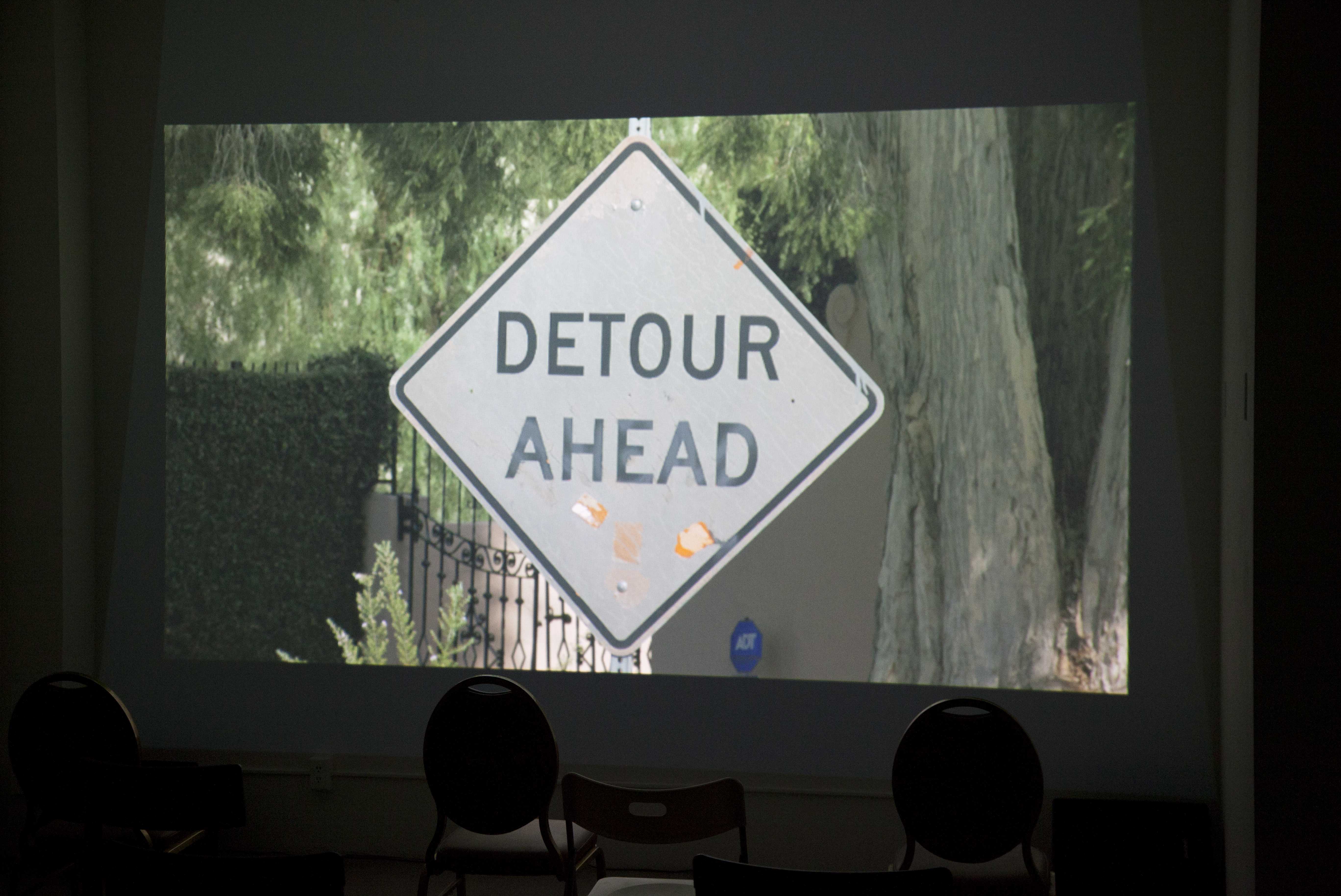
In part i, my attention in situating the visual subject matter of a film was compelled initially in examining what an atemporal film noir in passing would look like, faced head-on. Allowing time to study the shot as it continued to reveal its locality through further inclusion of a progressively expansive margin on all sides introduced a number of details off of center. The stoic position of the "DETOUR AHEAD" road sign, despite all the momentum occurring around it over more than a ten year duration of its installation on this stretch of roadway, invited a wandering eye to engage with the surrounding urban environment, seemingly negligent to the immediacy of its decree however defunct it had become in the passing of time. One detail that is discernible as the first movement of the film concludes became one of three referential matters that informed my response to part ii.
After the "DETOUR AHEAD" sign is entirely in frame, yet before the "No parking" and "District Permits Except" signs, installed directly above it on the poll come into frame, there is another sign that enters the shot. It is the second contained piece of legible text within a contained shape. Appearing in the background, at what proves to be the terminus of the entire three-act movement, a small, blue ADT Security sign is visibly staked in the earth at the perimeter of the house in-shot. Notably, this is not to be confused with the property listed in the credits of the film; in actuality, it is the property neighboring this address.
The parkway, while technically the domain of the city, a gray zone between public and private in itself, where the central sign of the film is installed, falls within the extended scope, to curb, of one property's numerical jurisdiction. By contrast, the angle it is positioned at which the camera directly paralleled (faced) placed this sign staked in the parkway from across the road, at curb's edge, as framed in front of the property adjacent. The exact angle of the "DETOUR AHEAD" sign, evinced by the paired camera to it, was exposed to being not wholly practical for passing drivers.
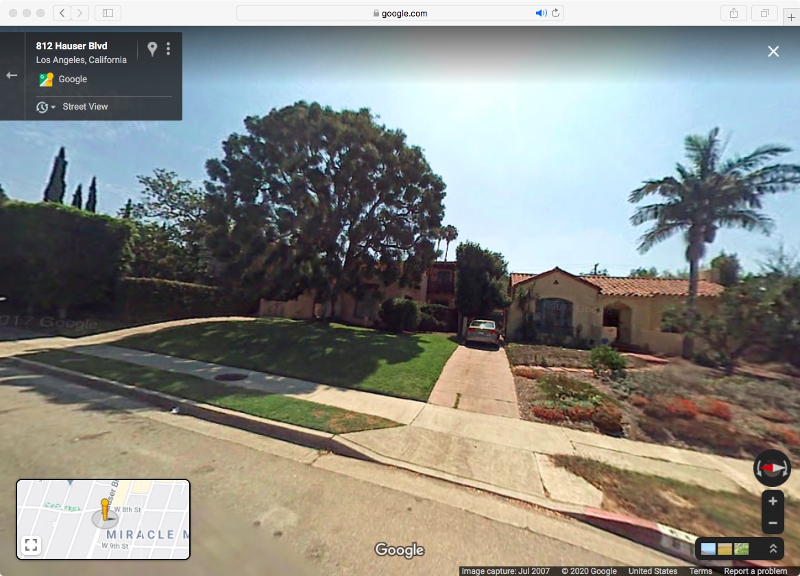
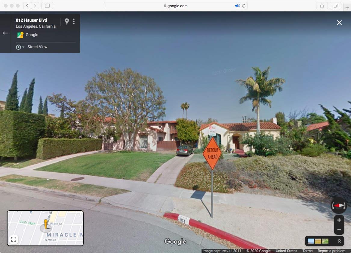
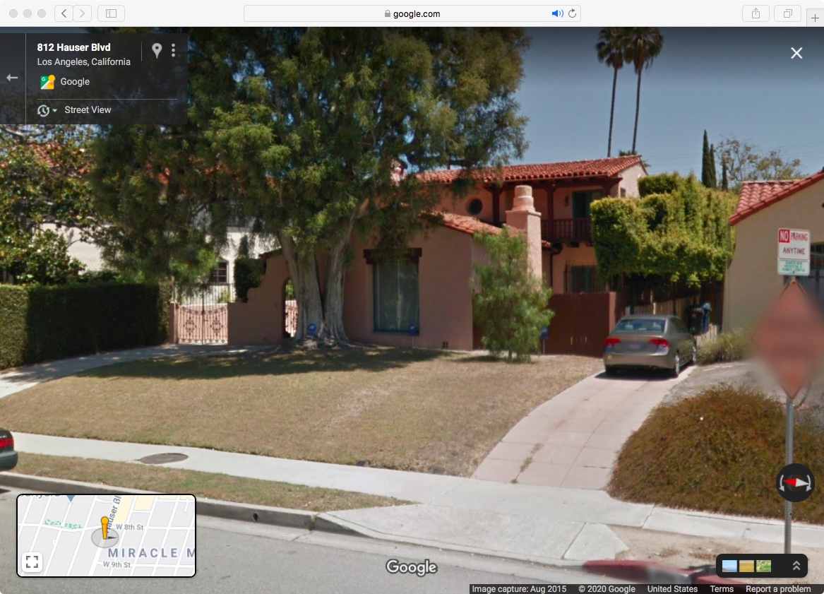
The position of the camera was as significant as the position of the central sign. The tripod temporarily occupied a grassy, municipally-maintained parkway, this landscaped buffer between street and sidewalk, before the limits of private property commence, still often absorbing the extended front lawn as green carpet to curbside in Southern California's arid climates despite the amount of resources, predominantly water, that has to be redirected to sustain this continuity of vegetation that is simultaneously shorn at regular intervals so as to limit its ascension thanks to this very resource. The use of water so as to cut back that which it grows is as paradoxical as it is ironic. By contrast, the road sign across the way was installed in a stretch of parkway, which, due to lack of maintenance, negligence, and/or atmospheric circumstances, had become variously a loose patchwork of dry dirt with tufts of dying grass here and there.
This adjacent house and its yard, which takes on a central cadence as backdrop in the film due to the angle of the subject matter, by-and-large demonstrates a modeling of more climate conscious landscaping relative to its geography. The landscaping that has occurred over the course of this sign's presence in the foreground, visible through the Google Street View "time machine" function, shows the transformation of what was in 2007, at the start of proverbial construction, a grassy yard evolving towards a draught tolerant one by 2018.
The ADT Security octagonal sign is notably smaller in scale relative to the "DETOUR AHEAD" diamond. Compared to the sun-bleached, yesteryear orange at roadside, it appears in full color in on-brand blue, quite likely in part due to the shade from the California Pepper Tree overhead. These two colors are themselves a pair insofar that they are compliments, located directly across the color wheel from each other. "ADT" appears emboldened, in all-caps white lettering. Conversely, "DETOUR AHEAD" appears in bold, all-caps black. One is staked on city property; the other, on private property. Both aim to be a deterrent of steady and straight interaction with what lies ahead. At face value, they announce inevitable incursions.
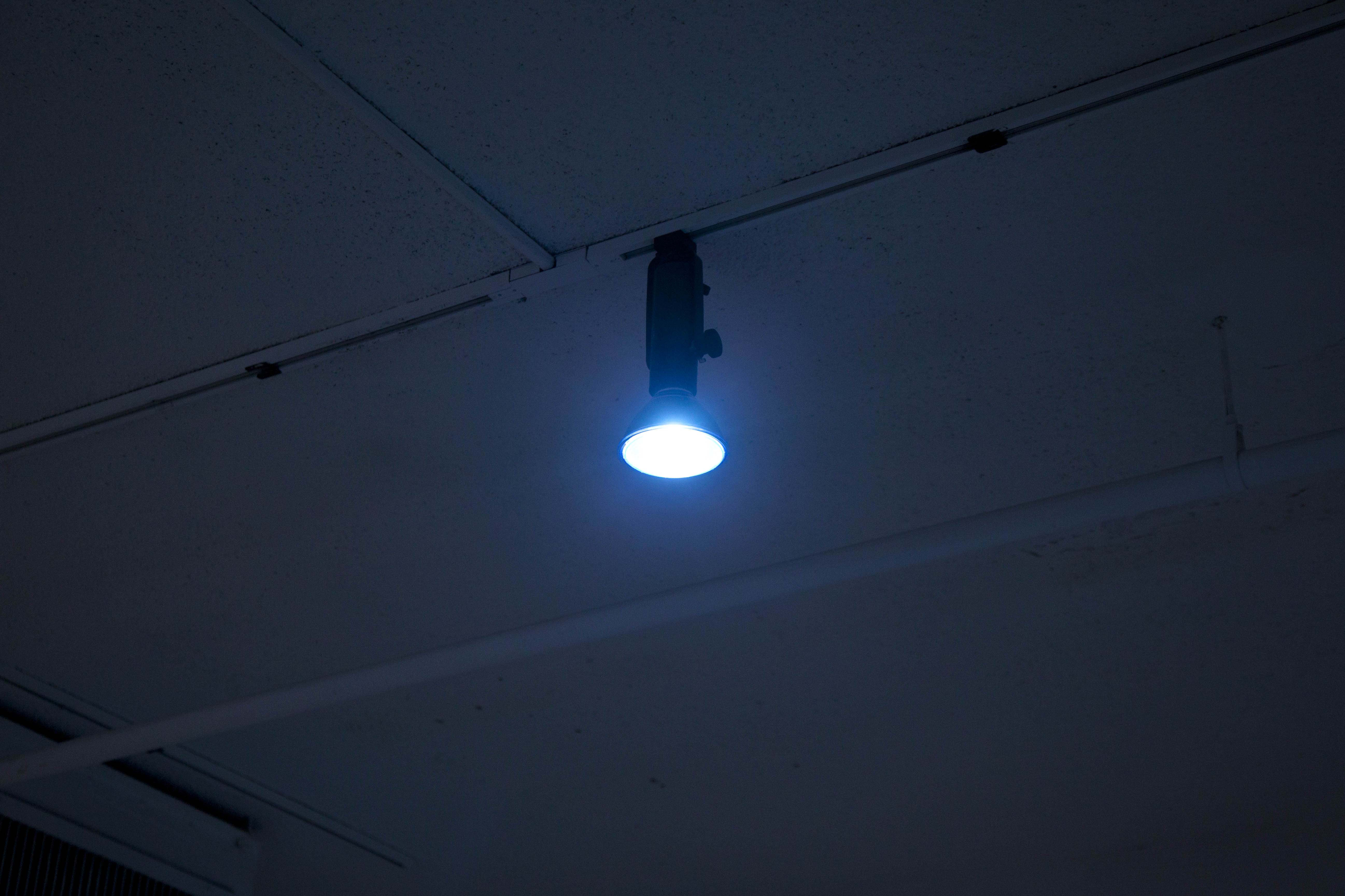
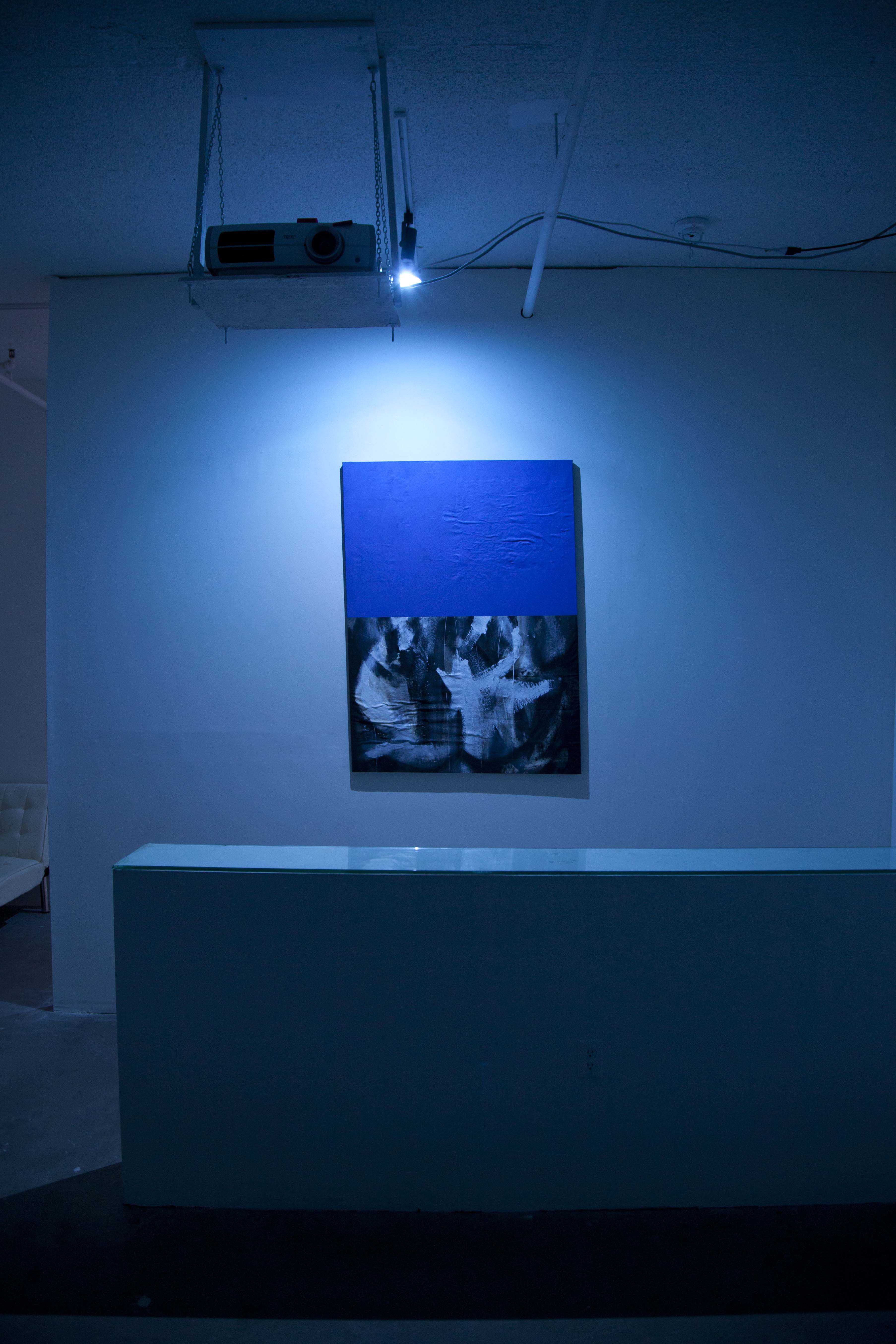
An important architectural conceit throughout this entire eighteen weeks of the scroll serial had been the installation of blue lights within the space, two in the entry area and one directly above the built-in partition wall, zoned for carrying responses to painting. In most of the screenings throughout the series, a rubric of these lights being on at the start of the event provided time to view the work installed on the partition wall, have a refreshment at the bar, socialize, and find a seat, before the lights were dropped and the screening commenced. Once the screening concluded, and any titles to works just shown were read by the curator, the blue lights illuminated the interior once more, which provided time to further consider the immediate response to painting, socialize further, and find the exit.
As noted, such was the dynamic in part i for Rocka Knittel and myself. If the duration of a screening were to be determined by the temporal limits of the event, are the lights turned on or do they remain off from the start? To what extent does this condition of the projected work break down the very premise of a cinematic viewing experience in concert with a painting on display generally dependent of a white cube setting, despite blue tinting from immoveable light fixtures augmented expectations? In part ii, a decision was reached to leave the interior lighting on concurrent to the projection for the entire four hour event. As the cinematic contribution extended the temporal dimension to the limits of the occasion, my contribution drew attention towards expanding observance of the spatial dimensions, which reached beyond the space of display as well as the painting's edge.
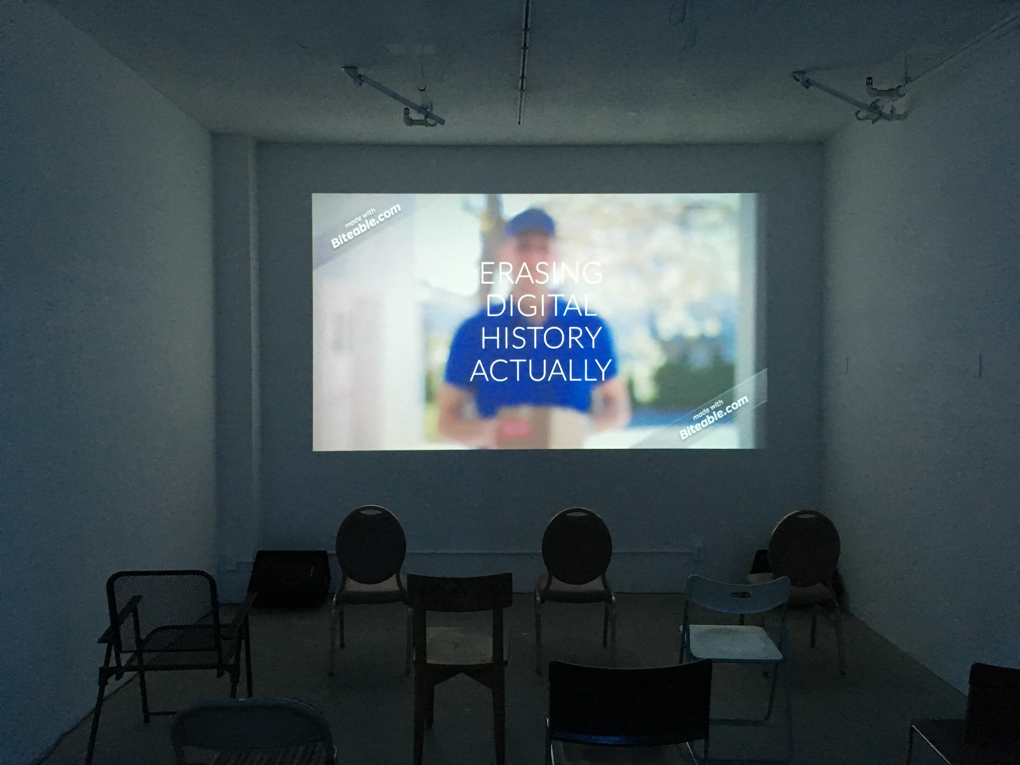
For part ii, Rocka Knittel's contribution consisted of a collection of previously self-authored short video works he had been compiling which ran through a digital, randomizing playlist projected onto the designated cinematic wall plane. As he described it to me in correspondence:
"I'm planning on showing a bunch of short video works I've been making with the website, Biteable. This website allows users to make videos for presentations (primarily business). You build the pieces from stock footage and graphics, but can [also] add your own text and audio. It's important to note that I use the free version [of the program], so all the pieces I'm making are watermarked and I cannot add my own "fancy" content (like my own video for example). Technically, you aren't supposed to be able to download the videos with the free service, but thanks to googling, I have found a work-around, so I can download the videos.
I am interested in Sergei Eisenstein's idea of the filmic fourth dimension. It's expansion of the idea of the montage, where, through editing, images are juxtaposed in a way that is not indicative of a passage of time (as in traditional montage). Most of my video work plays with this idea, and this is an elongated version of that. What this hopefully sets up is a sort-of subjective clean slate for considering the work that you are showing, and the installation as a whole. I will be using a video player with a random setting to play the videos. I had Matt list the runtime as "variable" as it's not quite an endless loop. It will just play for the length of the event, whatever that turns out to be."
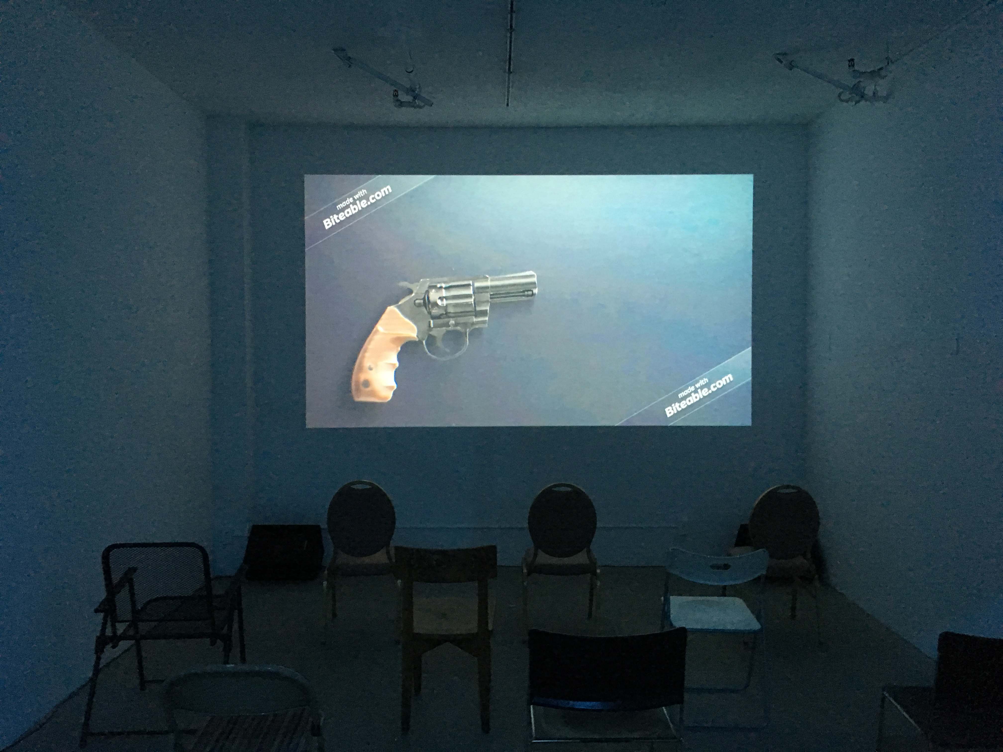
His request that the works play for the full duration of the event created a constant, randomized revolution of moving images accompanied by fluctuating sound levels that filled the room. In its own way, this stipulation broke away from the confines of cinema as those in attendance did not collectively sit together to view the suite of video works when a perpetual projection was already playing before anyone arrived. A refrain was notable in the way this rotation of moving image on a perpetual circuit connected this experiment in montage theory to Rocka Knittel's contribution in part i. This condition of erasing a hard and fast before-and-after to the act of screening constituted a scenario in which the lights toggling on/off, previously signaling an oscillation in attention from painting to film (and, ostensibly, back again to painting), was eradicated in this case. This entailed that the moving images cast onto the back wall simultaneously intermixed with blue light refracted by the interior room's limits.
My contribution to part ii drew upon these three blue interior lights as an infrastructural principal. Three modes of citation were incorporated into the space to localize this situation through what may have appeared in passing as disparate references.
Following the by-now codified default orientation, a painting was installed on the interior side of the partition wall, behind the bar, facing the projected imagery of Rocka Knittel. This painting-as-citation was an unstretched canvas I had painted on fifteen years prior that I had more recently donated to a colleague, Aaron Wrinkle, who had been adamantly pursuing painting in an earnest and prolific manner. In need of materials to work on and with, I had supplied him with those no longer of use to me. These several canvases I had bequeathed to him no longer served a purpose for me yet seemed unreasonable to keep in prolonged storage or destroy if they could potentially aid a peer stretching themselves through the very medium.
There is an explicit challenge induced in painting out and over someone else's prior efforts, perhaps exacerbated further when the second person knows the first, and further still when the first person donates this, in-kind, so as to be relieved of its keep. There is something akin to the conversation which occurs between graffiti writers and those who “buff” these incursions on structured surfaces. An attempt to flatten and reduce through erasure in fact quite visibly is not an act of subtraction but of addition, with graffiti being painted over and vice versa. Layers of accumulation. Observing the difference between the "DETOUR AHEAD" sign whose front face was coincidentally scraped clean just days prior to its recording, shown in film, so as to remove the build up of spray paint and applied stickers to its surface, and with this removal so too the flaking and peeling transparent top layer of the sign no longer serving this protective function, the back face of this sign, a galvanized metallic gray which had registered its own social commentary from passersby, was "buffed" with a gray, enamel paint, the drips of which rolled over and down the front face of the sign's diagonal edge. A substrative scrape on its recto, an additive brushstroke on its verso.


Although the provision of this unstretched canvas among the larger donation to Wrinkle was not contiguous to scroll, I contacted him and asked if he had a painting from this set that he would be willing to lend for its display in this context. He obliged. Entirely by coincidence, the painting he subsequently provided had been augmented by a coat of monochromatic blue applied to its upper half. This alteration constituted his painterly negotiation with the previous unstretched, painted canvas provided to him. The outcome left the bottom half of the canvas untouched, exposing the painted marks now receded underneath the blue upper. Having never visited the venue before, this display of the painting, and Wrinkle's choice of blue was startlingly in-tune with the curatorially rigid lighting fixtures.
The unstretched canvas he chose to submit had previously been painted with black and white acrylic onto an unprimed canvas weave. As a further augmentation, he mounted the painting on a stretcher bar support for its display on the partition wall. Due to an err in measurements during stretcher bar construction which he did himself, the resulting image on wall was without true verticals, slightly trapezoidal. These attributes in there own ways enacted a recall of the "Killer on the Loose" work from Rocka Knittel that was installed in this very location a month prior, painted in black and white and washed over in blue, as a unique painted object evoking an above-the-fold newspaper, cut at a skewed angle. Wrinkle titled this part ii painting "Split Screen."
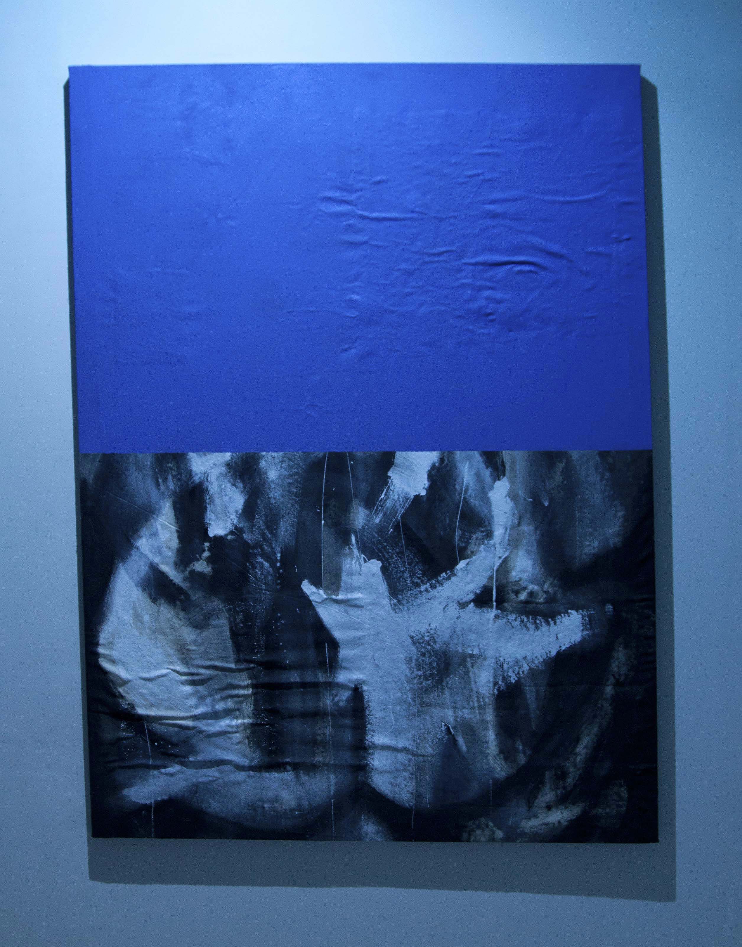
Wrinkle's monochromatic, blue overlay conveyed in the painting a shared space, a joint effort, however displaced in years of separation between once wet and recently wet incursions of layered image making by different temperaments and different reasons from different individuals. The horizontal split, while compositionally equalizing, entailed a foregrounding of the blue upper and thus a recession of my prior marks sent into an implied background.

One aspect I had continued reflecting on since part i was the acknowledgment of the larger production of all involved in the film exercise through inclusion of the credits. Painting historically is deplete of such pluralized acknowledgment in favor of singularized, solitary authorship. (more to be written in contrast of unionizing efforts of laborers in early cinema). In the structure of the scroll serial, more than one name always made the event, pointedly two, following the function of pairing. And Town being a quiet, ever-present third. Through inviting Wrinkle to contribute and have the painting by his choice, made up of more than one individual's marks, face Rocka Knittel's response, under Town's ever-present blue lighting, I was continuing to explore a living credits, in the space of painting, in co-respondence of pairing, in the context of the organized event. I requested that Wrinkle's name be added to the monthly announcement effectively altering "Adam Feldmeth & Keith Rocka Knittel" to read "Adam Feldmeth | Aaron Wrinkle & Keith Rocka Knittel". Just as it was here that a time code was listed on the monthly announcement for March events relative to Rocka Knittel's response to film - "variable" was entered in the place of a finite duration - the addition of Wrinkle's name counterbalanced this otherwise leaning towards film.
As for the vertical slash, this glyph can be best understood as the connecting of two dots. From A to B, and in their place, a bridge. Its development as a glyph is in the domain of cursive wherein the punctuation of the colon ":" was merged from what could be surmised as an attribute of greater economy of means of marks among scribes. A stroke, a drag, and a pull over double stacked dots. Curiously enough, on an American QWERTY keyboard, to generate this character onscreen, the stroke of two keys are required: "shift" followed by the key shared between the vertical slash and forward slash. There are two "shift" keys at the lower left and right of most board configurations. No matter which is chosen, there is a reach between “shift” and the vertical straightening of the slash that otherwise leans "\" on its own. In the context of the expanded crediting, the vertical slash was chosen to cite a relation between two names while also pictorially signifying a degree of designated division with the two appearing on either side of the vertical expanse in the space itself, namely, the partition wall. What could be called another split screen brought on by architectural punctuations.

Built by Town, with the help of Carl Pomposelli, specifically for this series, its incorporation into the existent architecture was three-fold. Firstly, it blocked a significant amount of light leak into the smaller interior that would otherwise pour into the space from the florescent hallway lighting, which could not itself be turned off during the events. Secondly, the partition provided a wall plane for the responses to painting to be incorporated thereon. And thirdly, it drew a level of privacy into the dualistic zone of reception. That the wall established an intimacy was itself dualistic in the way it also obstructed view in for hallway passersby, most specifically the chance roaming nightwatchman. The weekly alcoholic beverages being served to those in attendance were technically not cleared with building management as they would have required the hiring of an officiated bartender. This illicit behavior, if discovered by building security and/or management, would bring repercussions for Town as an artist-in-residence, if not by extension the other few residents he was then sharing the facilities with. The partition provided this buffer.
The second citational inquiry aimed to draw attention to this cover which the partition provided for the proceedings on all three accounts. The partition itself was an architectural floor-to-ceiling appendage for the architecture of the series as much as it was a constructed object painted on all exposed faces so as to integrate into the room - A sort of active camouflaging through the use of white paint in order to heighten a darkened interior. One noticeable presence that lingered throughout the eighteen weeks upon entering the room was a pungent odor. The nose eventually stopped processing this scent over a prolonged period in the space yet was inevitably always sensed immediately upon each subsequent return. This odor was, in fact, emanating from the paint used to coat the partition which continued to off-gassing in an interior, zoned for artistic studio work by building management, while lacking proper ventilation.
I learned from Town that the can of paint used on this built wall happened to be quite old as well as previously used. Upon opening its lid during partition construction, this discovery did not deter its use, which ultimately propagated this olfactory byproduct that hung in the air of the room. I had noticed early on when visiting the space prior to the start of the series, how the coloration of this white enamel used to coat the wall was visibly distinct from the color of the existent walls. From this vantage, the fixed blue lighting seemed to observably provide some cover of its own, drawing the eye away from this discrepancy of an off-white partition through augmenting the atmospheric conditions of the entire space and mitigating any immediately apparent discrepencies in semblance of a continuity.

With the painting provided by Wrinkle drawing attention to the single blue light fixture mounted above it, two additional inclusions to the overall contribution to part ii emphasized the other two light fixtures in the space. Both were located in an otherwise emptied interior entrance space/anti-chamber within the room. This absent reception was due in part to the preexisting layout of the room coupled with the partition wall which privatized the series of events at a distance from the glass walled buffer into the florescent lit hall. In weeks where all paired contributions were self-contained in the recessed interior for screenings, this preliminary area, viewed from the hall, was devoid of signification that any event was occurring other than the interior lighting that cast the room in a blue glow.
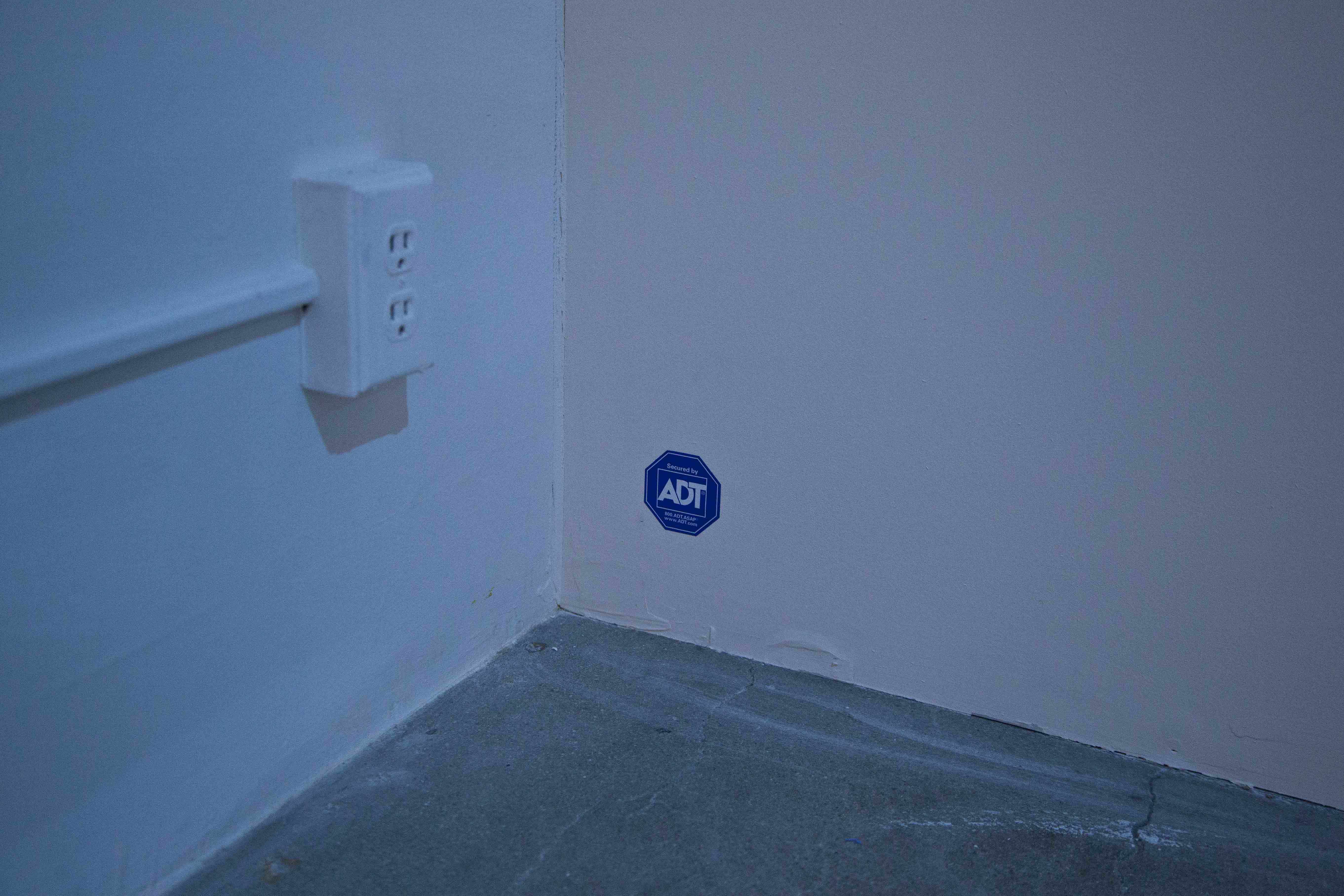
To draw attention to this dimension of privatization induced by the incorporation of the partition, an ADT home security sticker-appliqué was affixed to the bottom left corner of the hall-facing side of this vertical (and horizontal) slash in the space. The presence of this pictorial footnote adjacent to the point of contact where the partition and the existing wall it interrupts meet, both subdued and amplified by the second blue light fixture centered on this wall face, drew attention to discrepancy of the two white paints. It was specifically the blue in the ADT logo that emphasized the yellowing off-white it was installed upon otherwise masked well by the blue lighting as a physical obstruction to get around to enter the screening room beyond.
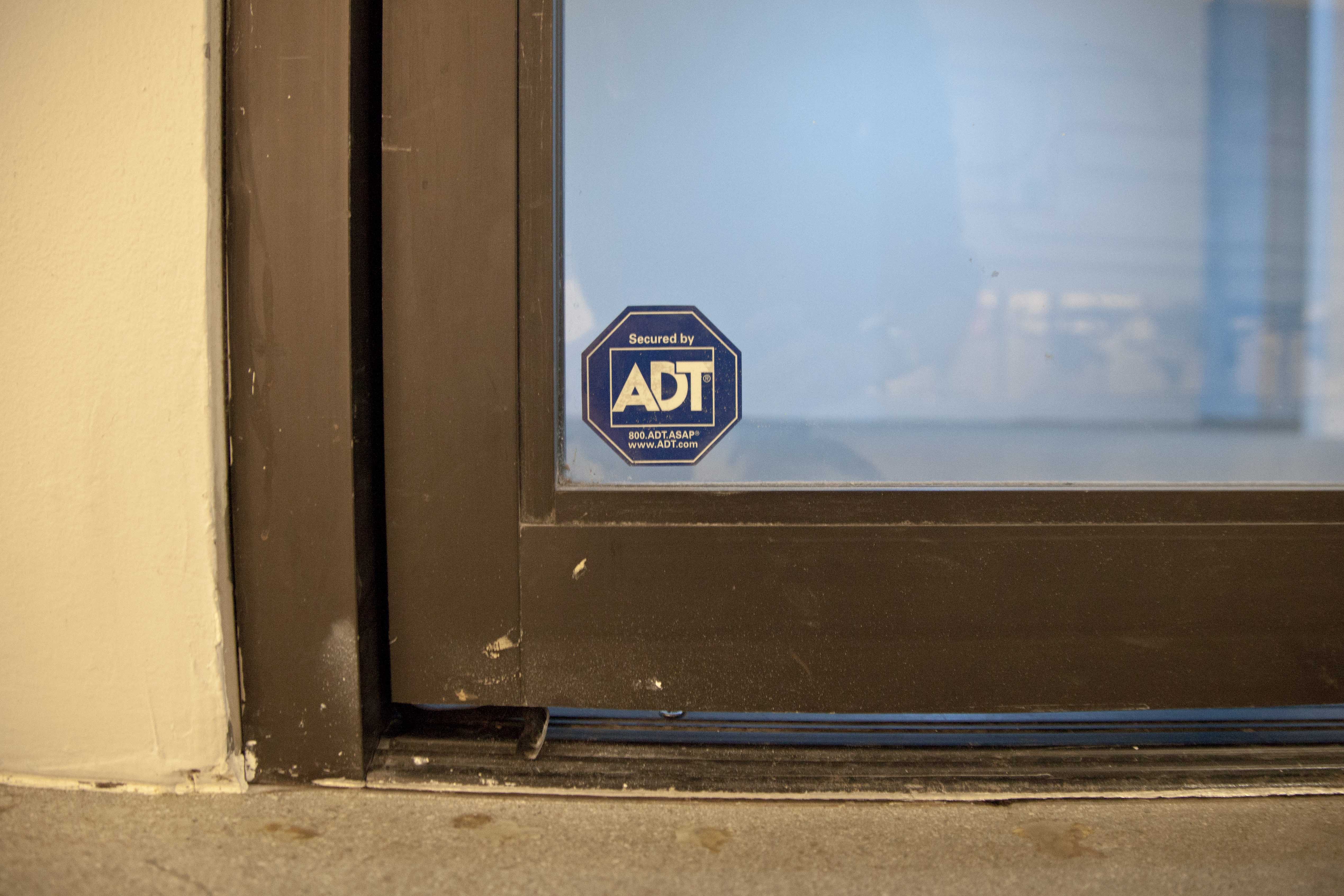
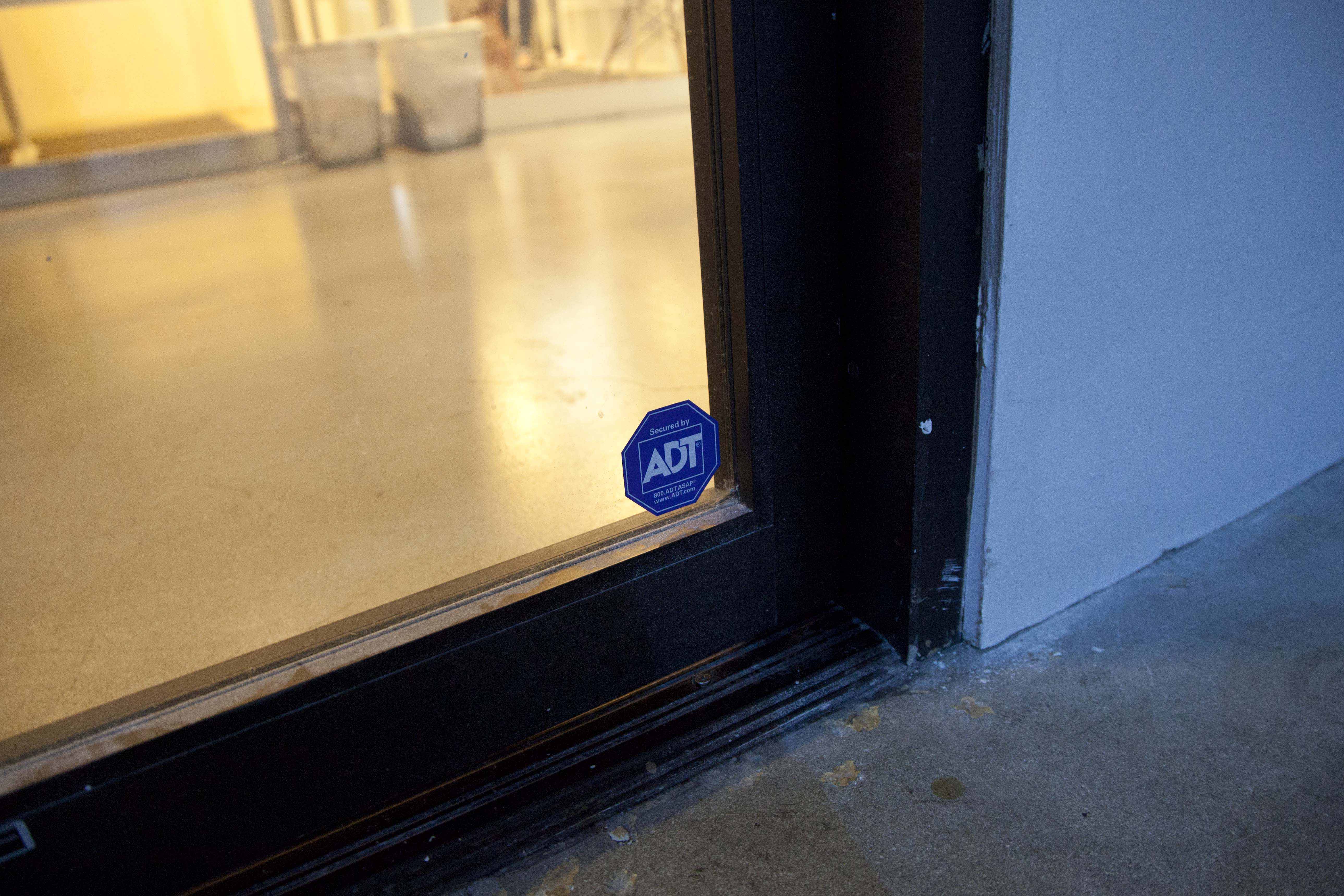
A corresponding second ADT sticker of equivalent scale and design was installed in the lower left corner of the glass entrance door leading into the space from the hallway of the building. Chosen to match the specific design of the ADT sign installed at the perimeter of the house visible behind the "DETOUR AHEAD" sign spatially and beneath this sign compositionally, these decals were purchased from a third-party seller. While the compositional relation between the two signs in the film places the presence of ADT in a lower right position to the road sign, its installment at the edge of the outer street-facing wall of the home to which it was protecting is notably on its lower left.
These decals are two-sided, designed as such for installation on the interior side of glass barriers within a residence, simultaneously remaining legible from the exterior as much as from the interior. This entailed that the one affixed to the entry door was dual facing, discernible from the hallway as well as upon one's exit through the same passage. The interior facing logo drew its own face-off between its companion sticker on the partition wall across the way. The intent here was both to engage the remaining depth of a room subdivided by the partition after the twenty-three feet between the cinematic and painterly planes was incorporated into the pacing of the three-tiered zoom of the film, delivering the audience both across the street from the road sign (a greater spatial distance than twenty-three feet) as well as across the screening room where the "Killer on the Loose" artwork resided, a pair exactingly twenty-three feet apart. I reasoned that only installing an ADT decal on the partition would decouple it from its indicative symbolic use along the perimeter of structures. In contradistinction, only applying it to the glass entry door to the room might have led to it being too innocuous and passed by without notice by attendants. Drawing this logo further into the interior of the space, which was located in a hallway on the eleventh floor of a building with similar hallways on as many floors, drew the eye towards the partition that occluded the proceedings even further within.
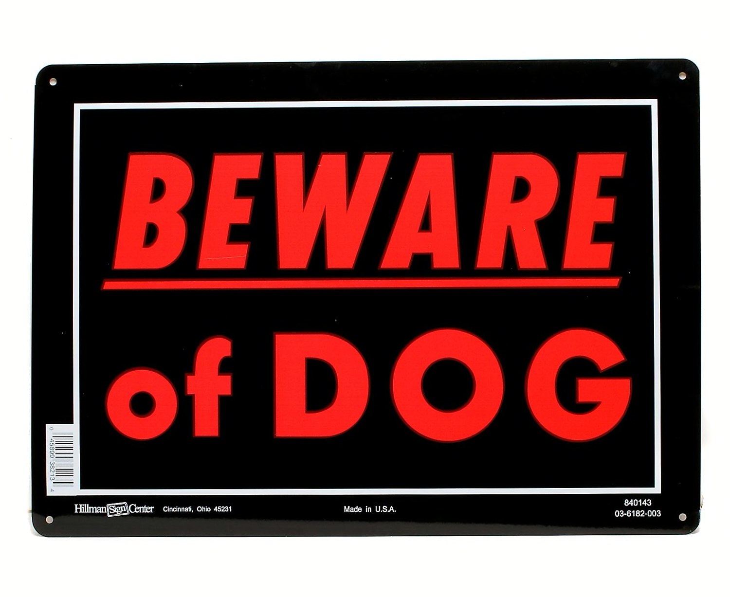
Together, this pair of decals functioned in their decoy capacity as much occurring with the introduction of the partition to obstruct direct visibility of unwarranted distribution of alcohol beyond this opaque barrier as when a business, residence, or other structure purchases the ADT signage through a third-party source without purchasing the actual security system from the company itself. While it is not easy to determine how wide-spread the performed presence of ADT signage alone is, this route in attempting to deter trespassing, breaking and entering, and the like, places trust in the symbolic power of the logo alone. This is not dissimilar to a private residence that hangs a "Beware of Dog" sign along its perimeter, especially if the property does not house an actual dog. These are warnings absent of an infrastructural correspondence.
The history of the ADT logo and the company it serves as public promotion material for begins with the invention of telegraphic communication. American District Telegraph (ADT) entered into the security business in 1874 prompted by a fabled break-in to a home residence, spurring the founder, Edward A. Calahan, to develop the first security system network. This pivot commenced through deploying a fleet of "Roundsmen", a bicycling night watch, to regularly patrol paying neighborhoods. As technology evolved over proceeding decades and further integration of automated alarm systems into structures advanced, the company as a monitor in preventative crime spread nationwide. In 1989, the now iconic octagonal, blue backed yard signs carrying "Secured by ADT" on their face were implemented with every property installation of the infrastructural system. This significant step in publicly displaying an otherwise invisible alarm system through logo signage by way of staked signs and window appliqué thereafter becomes an indicator of instated security by the logo’s overt display. The octagonal shape, playing at an unconsciously registered "STOP" replaced here by "ADT", with blue traded for red, signals we should halt any forward progression…And check both ways, until "the coast is clear", before proceeding?
Through incorporation of the ADT decals on the two visible barriers of the space - the first transparent, the second opaque - I was further interested in drawing a referential contrast to the third-party security company hired to monitor The Reef Building. With the events of the scroll serial occurring after business hours, admittance into the building involved direct engagement with a security guard stationed at the front desk in the ground floor lobby. Having already been notified of the scheduled events, a visitor would be asked to declare their destination within the premises for verification purposes, add their name and this info to a sign-in log, and be issued a visitor's badge, an inkjet printed sticker with black lettering on red ground, to be applied to their lapel before proceeding to the elevators, ascending up to the eleventh floor, navigating halfway down a hallway off the landing, until ultimately arriving at the seeming vacant venue lit in blue. As with passage into the venue, the entry into the building was also its exit. Passing the front desk security once more was a followup to each attendant's experience. Likely due to consistency in attendance over successive weeks, I had noticed a familiarity in face recognition forming between the lobby guard and regular visitors to the point where there ceased being any need to state one's business, to what floor they were going to, signing into the log, nor being issued a visitor’s badge. Security would wave a regular attendant to scroll through as though they were not a visitor but a tenant of an internal rental property.
While the public event was a one-night affair, the additions of ADT decals to the door and wall were installed 24/7 for the duration of a week between screenings. What narratives does a neighboring tenant on this hallway begin to imagine when encountering such indicators of personalized security when walking down the hall which do not correspond with the service hired to secure the facilities? Would this added layer of security be noticed in passing?
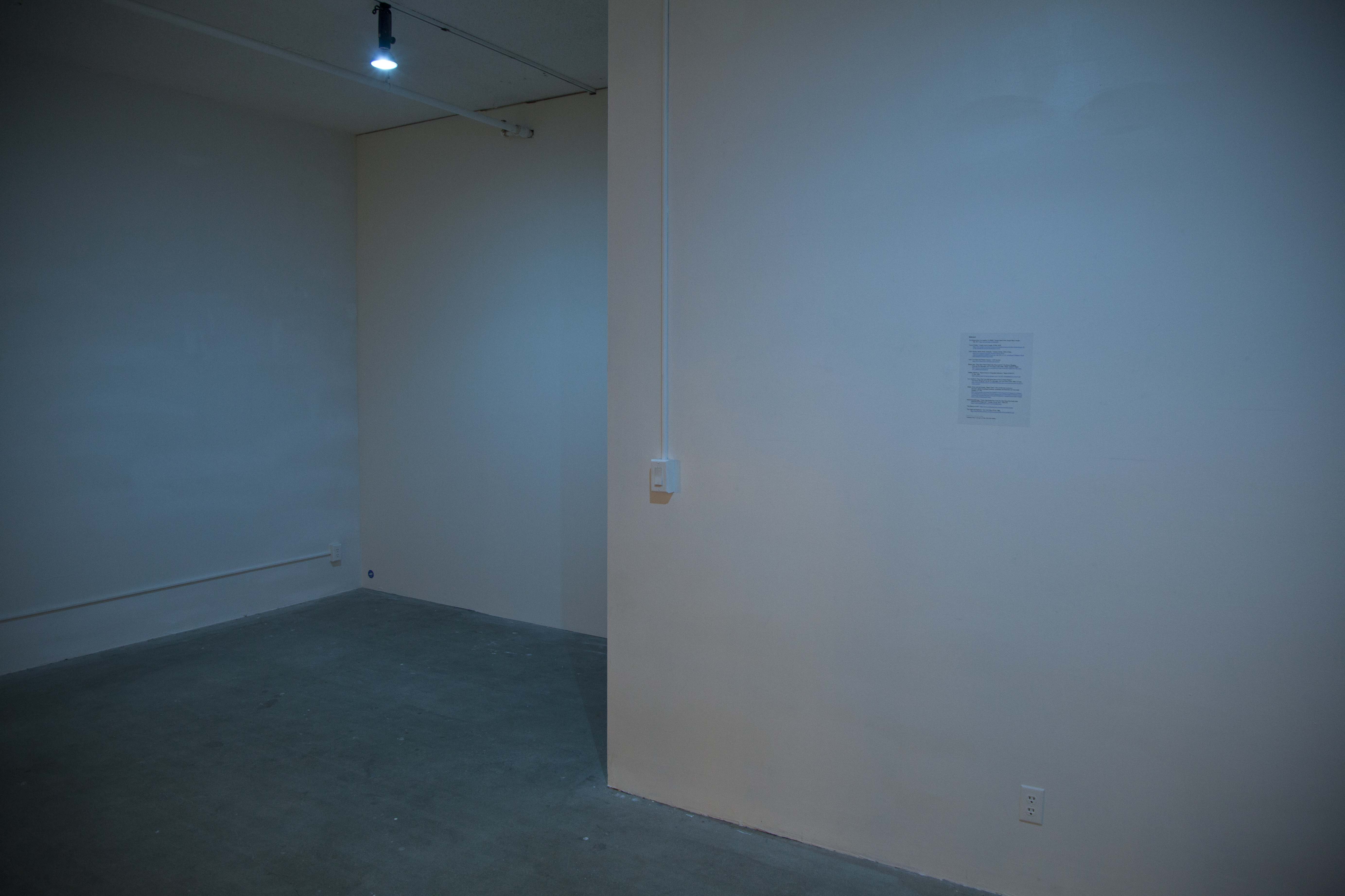
On a preexisting partition in the room's internal entrance space lit by the third blue light fixture, a single printed page of bibliography listed hyperlink references. This document provided acknowledgment of research contributing to the varying aspects of my contribution to part ii. The 8x11.5" page was spray mounted to the wall, on-center, right of the sole light switch that controlled all three fixtures in the space. The text was set in Times, 12 point, black font. Due to its printed state, the discernible hyperlinks set in blue underscore, though symbolically recognizable as active, non-static text, were in this case compressed by the materialization of these references as ink on paper. By extension, this rendered them static.
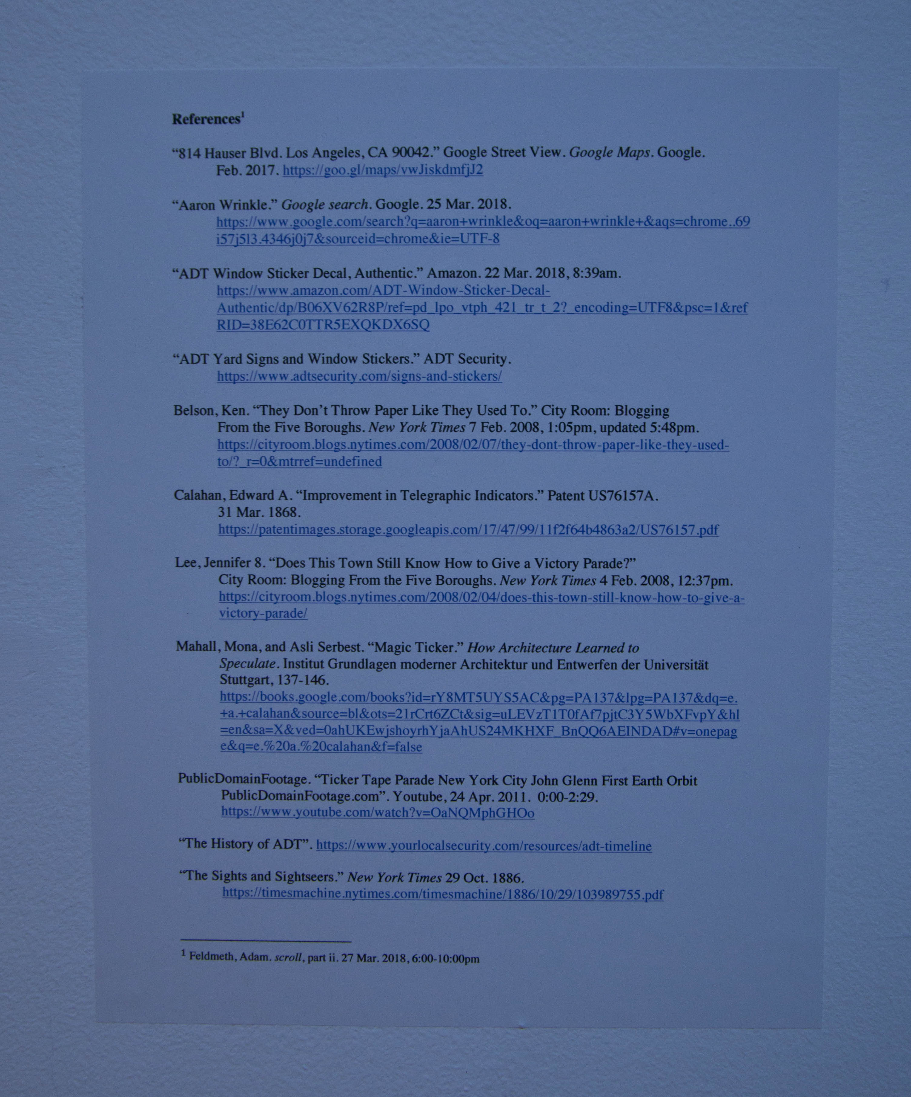
The bibliography, formatted in descending alphabetic order, was comprised of three focal zones of research that paired with the three, blue highlighters in/of the room. A recent Google search for "Aaron Wrinkle" provided an opportunity to further contextualize Wrinkle's artistic work both as it had been personally archived by the artist, to date, as well as how his public projects had been archived by others.
A second set of references attended to the history of ADT. These included: the then current Google Street View tethered to the residential address of the "DETOUR AHEAD" sign with the ADT yard sign in the neighboring property also in frame; an amazon.com virtual marketplace listing for "ADT Window Sticker Decal, Authentic" on-sale by a third-party vendor; a subpage from the ADT website outlining their yard signs and window stickers as the first line of defense while reminding that these are "just the beginning"; and a self-historicizing timeline from the same website chronicling the company's stages of progress as a service that began in telegraphic communication.
The third area of research took up an expansion of the very bibliography itself as an implied transmission of references elsewhere within the space. This group of references traced an alternate trajectory that mutually began with a major step in the invention of the telegraphy, patented by ADT's founder, Edward A. Calahan. These included: Calahan's Patent US76157A, which was filed in 1868 under "Improvement in Telegraphic Indicators"; an excerpt from the chapter, "Magic Ticker" from How Architecture Learned to Speculate by Mona Mahall and Asli Serbest, which historicizes Calahan as the inventor of the first stock telegraph-printer, or stock ticker; an article from 26 October, 1886 from the New York Times entitled, "The Sights and Sightseers", documenting the ad hoc genesis of ticker tape parades stemming from impulsive "stock boys" not warranted to leave their posts to enjoy the festivities at street level and yet so enthralled by the scene unfolding below that they grabbed the used ticker tape at their feet and began hurling it out the open windows of the Financial District high-rise to contribute some flair to the affair; a two and half minute segment from a youtube.com post of digitally transferred footage now in the public domain of a 1962 Newsreel of the ticker tape parade held in celebration of John Glenn's first earth orbit in which the voice-over narration notes the tape present in the shots was "thinner" than that used in earlier times do to strides in stock market machine technology [leading towards eventual dematerialization]; and two New York Times blog posts from February 2008 entitled, "Does This Town Still Know How to Give a Victory Parade?" and "They Don't Throw Paper Like They Used To", each noting that in the twenty-first century, the citywide victory lap in the U.S. context was looking more and more like a relic of the former century.
To what extent may this be due to a distantiation towards victory, replaced thereafter by preemptive victimhood, espoused through preventative measures to "bar the gates" from a breach, which speculation suggests to be imminent after the abstract "War on Terror" is declared? An American celebration for specific victory en masse has become as dematerialized as the stock exchange is due to its micro-trading. Has this become our secure victory? The year these blog posts were written would beg to differ for the people cast onto the streets while the "stock boys" behind their sealed windows above, proceeded to line their pockets with proverbial paper.
Upon entering the room, everyone who attended the March 27 event was personally sent a digital pdf version of the bibliography for non-static access to its contents, which could either perused while in the space or thereafter on devices at their leisure. If accessed while present, this delivered pdf, telegraphed to them by electronic means, would be received on mobile phones that invariably required one to scroll through the various bibliographic references, if not also touch the blue hyperlinks to subsequently scroll through these opened materials. The pdf on these smaller screens appeared as its full 8x11.5" format. Thus, in order to more clearly read and/or accurately access specific reference links through tapping the glass, an attendant would need to pinch-to-zoom in for greater discernment, the inverse movement of the film, and in so doing invoke both a visual amplification of the text, and in compliment, a sensation of the fine print coming towards them. The static materialization of the bibliographic content became activated through its electronic transmission, not unlike the blue lights activating the room and all in it through the on/off switch on this shared wall face.